‘Great News’
In the new NBC comedy “Great News,” a TV news network is turned upside down when the mother of one of the producers takes a job as an intern, with hilarious results. Pentagram’s Emily Oberman and her team have designed the colorful opening titles for the series, which was created by former “30 Rock” writer Tracy Wigfield, who recently received the great news that it has been renewed for a second season and will be moving to NBC’s Thursday night “Must See TV” line-up.
The titles reunited Oberman with the creative team behind a pair of hit comedies. “Great News” is co-executive produced by Tina Fey, Robert Carlock and David Miner, who all worked on “30 Rock,” for which Oberman designed the identity. Oberman also created the identity and titles for “Unbreakable Kimmy Schmidt,” the current Netflix series produced by Fey and Carlock.
“Great News” is a cross between a witty workplace comedy and a classic family sitcom, but in the “30 Rock” mold, with lots of playful references. The show is set in the offices of the news network, where producer Katie Wendelson, played by Briga Heelan, contends with her meddling mom and now co-worker Carol, played by the legendary Andrea Martin. The cast also features John Michael Higgins, Nicole Richie, Adam Campbell, Horatio Sanz and Wigfield herself, who plays Beth, the apocalyptic weatherperson.
The exuberant title cards play off the name of the show and pick up on the two sides of its premise. The typography, set in a friendly modified DIN Condensed, zooms in dimensionally, flashing and pulsing in the manner of breaking TV news graphics before gently arcing up to suggest a smile or a birthday banner. The sequence is accompanied by theme music composed by Jeff Richmond (Fey’s husband) that is a perfect blend of bracing TV news blast and cheery sitcom.
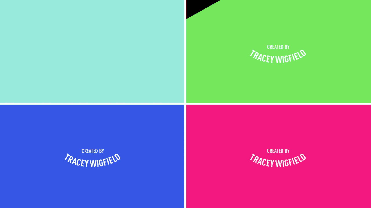
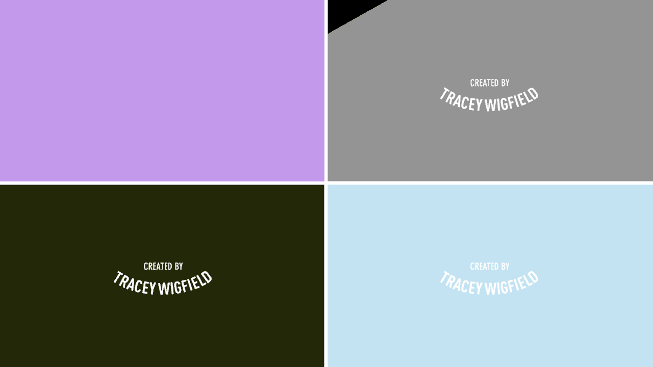
The colors of the title sequences change with each episode, appearing in vibrant color combinations inspired by one of the themes or plot lines. The graphics for the original pilot featured typical TV news colors of bright yellow and blue. Subsequent episodes have featured black and white for an episode where lead anchor Chuck goes temporarily blind; bright fire engine red for an episode that revolves around a serial arsonist; and camouflage green and olive for an episode where a reporter returns from covering a war zone.
“The humor of ‘Great News’ is smart and fun, and that’s what we tried to capture in the titles,“ says Oberman. “It was a pleasure to work with Tina, Tracy and crew again, and we’re thrilled the show will be returning next fall!”