
Cooper Hewitt: A Democratic Design Identity

The interiors of bags at SHOP Cooper Hewitt ask users to please reuse, an idea that extends to the museum identity itself.
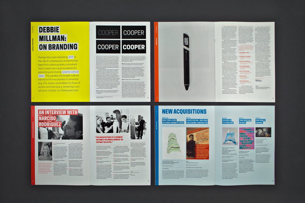
This summer Cooper Hewitt, Smithsonian Design Museum celebrated its 40th anniversary at the landmark Andrew Carnegie Mansion in New York. The institution marked this milestone following a major renovation, completed in December 2014, that restored the mansion and expanded the museum’s exhibition space by 60 percent. The revitalization also introduced a new program of graphics for Cooper Hewitt, developed in collaboration by Pentagram’s Eddie Opara and Michael Gericke and their teams, that encompassed everything from a new name, graphic identity and custom typeface to the website, environmental graphics and wayfinding, and exhibition graphics. In the year-plus since the museum reopened, this visual system, outlined in a massive 408-page style guide, has been brilliantly implemented by the Cooper Hewitt and the designers of its in-house design department, who continue to find new ways to showcase the identity’s versatility.
As the nation’s design museum, Cooper Hewitt has the mission to educate and enlighten the public about all things design. The revitalization project originated under the watch of Cooper Hewitt Director Bill Moggridge, who passed away in 2012, and was continued by his successor, Caroline Baumann. Moggridge had a belief that “people learn best by doing,” and this point of view was integrated into every aspect of the project. The exhibitions and programming encourage participation and play at every turn, and include a revolutionary interactive “pen” that allows visitors to “collect” objects they encounter in the galleries. The educational imperative also extended to the identity and graphics developed by Pentagram, which establish a distinctive visual brand for Cooper Hewitt and at the same time help explain and illustrate what design does.
The museum’s demonstration of good design in action comes by way of some of the top talent in the field. The relaunch was developed in collaboration by a roster of leading designers and design firms, which in addition to Pentagram included Diller Scofidio + Renfro (master planning, galleries, exhibition spaces and the 90th Street canopy); Beyer Blinder Belle Architects (master planning and restoration); Gluckman Mayner Architects (interior renovation); Hood Design (landscape design); Goppion (display cases); Local Projects (interactive media); GE, Sistelnetworks and Undercurrent (the interactive pen); Chester Jenkins/Constellation (the custom font); and Irma Boom (the collection book). The result is a dynamic national home for design—in a former home, no less.
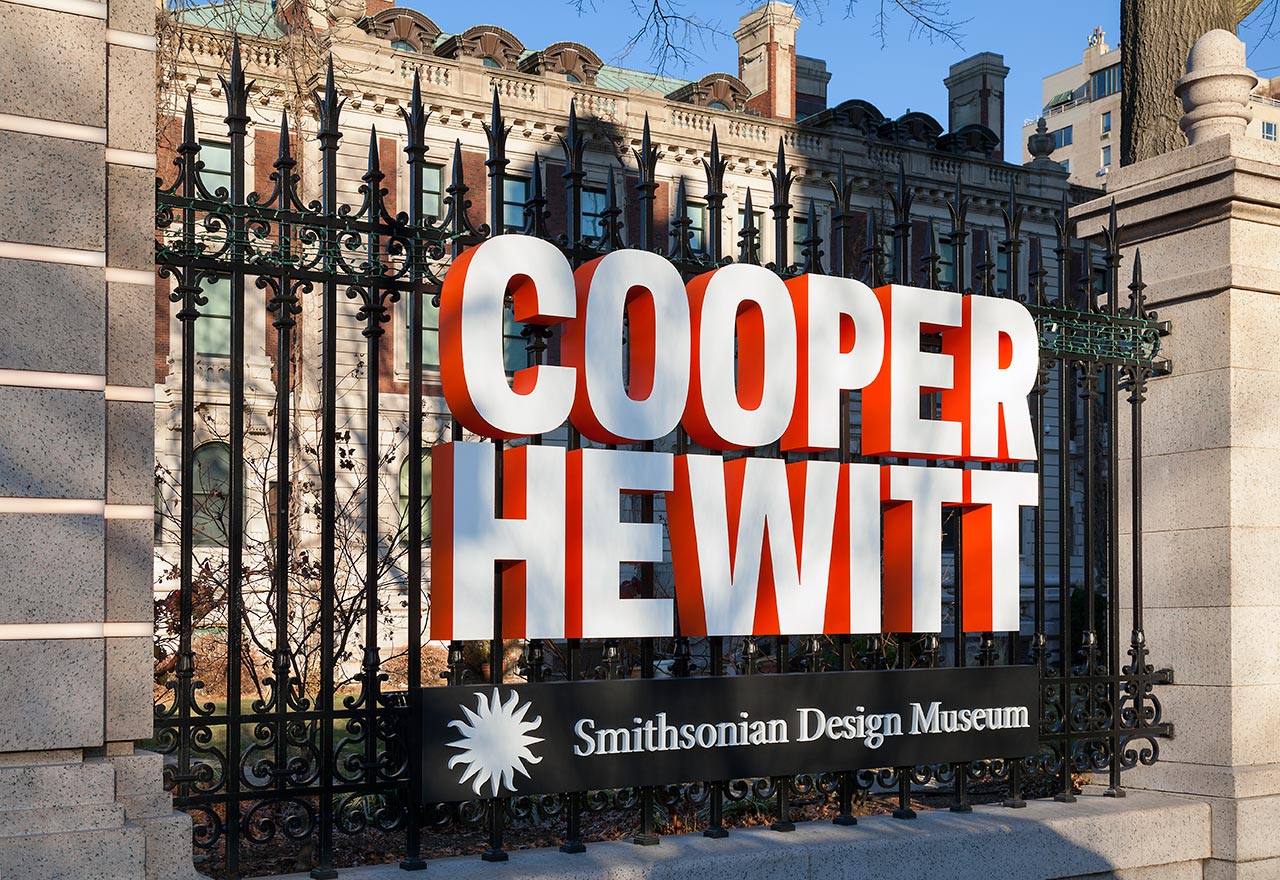
The project encompasses a program of environmental graphics, including dimensional signage that integrates the identity into the grounds of the historic Carnegie Mansion.
Originally built in 1902, the 64-room Andrew Carnegie Mansion is a fitting place for the nation’s foremost design museum. Design innovation is part of the building’s heritage; it was the first private home in the U.S. to be built with a structural steel frame, and one of the first homes in New York to have a push-button elevator and the first modern example of air-conditioning. The building was landmarked in 1974 and Cooper Hewitt took over the space in 1976. The three-year, $91-million renovation that debuted in 2014 restored the historic mansion and increased total exhibition space from 10,000 sq ft to 17,000 sq ft, including a new 6,000 sq ft gallery on the third floor. Everything about the museum was new, from the signage and entrance on 90th Street, to the location of galleries and the Shop, to the name, Cooper Hewitt, Smithsonian Design Museum.
The modernization included the identity. While other museums are reorganizing under brands that are visibly fussy or distractingly minimal, the Cooper Hewitt identity is utilitarian and purposeful. Pentagram had a mission to visualize the museum’s approach in a way that felt authentic. Design process is the lens for all the museum’s programs, and working closely with Baumann and the museum leadership, the designers developed an approach to the branding that invites interaction and experimentation.
The identity exists as both an iconic wordmark and as a useful tool. It establishes a robust and flexible branding system for the museum built around a new typeface, appropriately called Cooper Hewitt. In a breakthrough innovation, the identity was conceived as a design that truly belongs to the people: The typeface has been made available free to the public, who are encouraged to utilize it in their own designs. The font was created by Chester Jenkins in collaboration with Pentagram and was also acquired for the museum’s permanent collection.
The Cooper Hewitt, Smithsonian Design Museum wordmark, set in the Cooper Hewitt typeface.
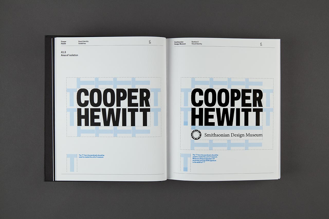
The typeface is based on the Cooper Hewitt wordmark designed by Pentagram. Unique, engaging and highly functional, the wordmark forms a perfect rectangle that can easily be scaled, positioned and colorized without losing its strong visual presence. There is an intriguing relationship between the words “COOPER” and “HEWITT” in the identity: Set normally, the words are different widths. Here, each character has been tailored to help define the overall typographic frame. The logo has been expressly designed to serve as the basis for a variety of uses.
“Cooper Hewitt’s new identity plays it straight, with no play on visual or theoretical complexity, no puzzling contradiction or ambiguity, no distracting authorship,” says Opara. “Function is its primary goal, and ultimately the logo is important, but not as important as what the museum does.
“The identity reinforces the notion of a contemporary Cooper Hewitt. Inside the museum’s historic shell lives a bold statement and the meaningful actions of design. The logo is bold in weight and tailoring; it is durable and functional, and there is even a bit of fun to it,” he adds.
The Cooper Hewitt typeface is a contemporary sans serif with characters comprised of modified geometric curves and arches. The font evolved from a customization of Galaxie Polaris Condensed that Opara originally commissioned for the identity. Jenkins designed a new, purely digital form built on the structure of Polaris. The new font is redrawn from scratch, using the existing forms of Polaris as a rough guide for letter widths and master-stroke thicknesses. The typeface has numerous weights that are used carefully in certain contexts for different mediums.
Comparison of the final wordmark in the Cooper Hewitt typeface with the existing fonts Galaxie Polaris Condensed Heavy, top, and Galaxie Polaris Semi-Condensed Heavy, center. Comparison of the final logotype with the Cooper Hewitt Heavy typeface, above.
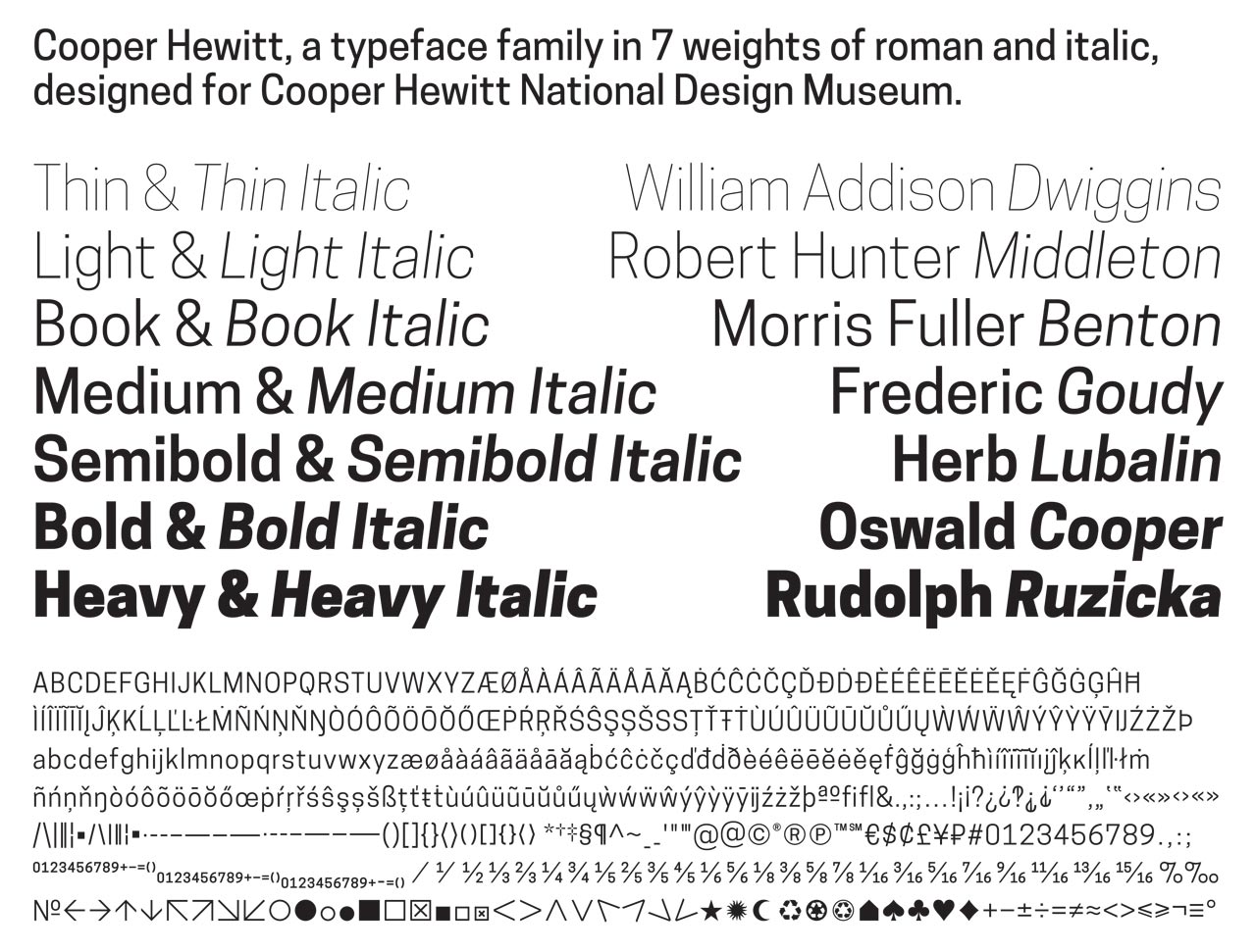
The Cooper Hewitt typeface family.
Cooper Hewitt is available as a free download as installable fonts, web font files, and open source code on cooperhewitt.org. Using the typeface gives the user insight into the experience of being a designer, if only in setting the type. It also helps disseminate the Cooper Hewitt brand and the idea that effective design should be accessible to everyone.
“We are spreading good design by making our elegant new typeface, Cooper Hewitt, available as a free download on cooperhewitt.org, as well as collecting it as an important example of the design process,” Baumann said when the font was released. “We look forward to seeing how the public uses this new design tool in their lives.”
Widely used across all the museum’s media and collateral—from object labels to the website—the font has become closely associated with its namesake. To date, the font has been downloaded over 30,000 times.
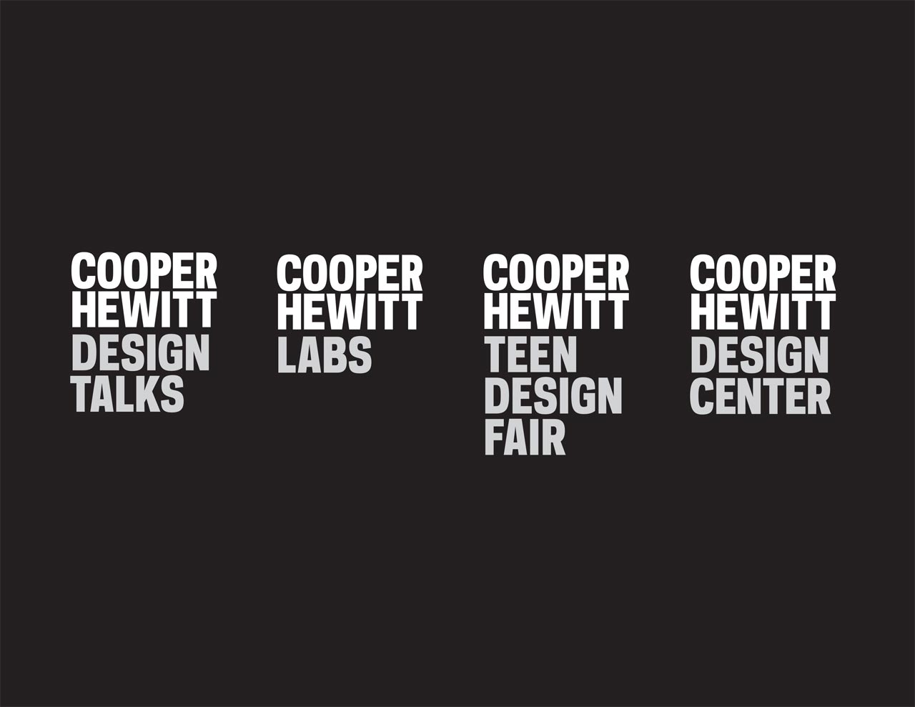
The new wordmark provides a strong anchor for various sub-brands.
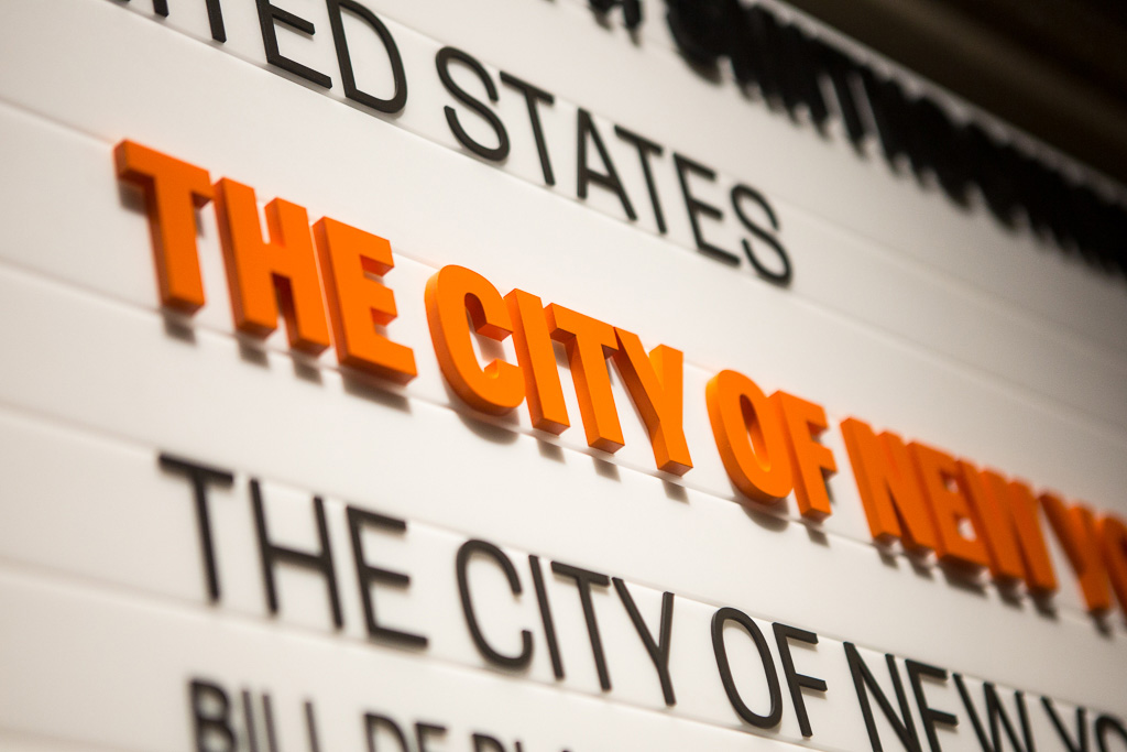
Pentagram also helped develop the museum’s new name. As one of the group of 19 museums and galleries that make up the Smithsonian Institution (American’s National Museum), the Cooper Hewitt is the Smithsonian Design Museum. Formerly known as the Cooper-Hewitt, National Design Museum, the new name replaced “National” with “Smithsonian” and eliminated the hyphen, simplifying the brand while emphasizing its heritage. In some applications the new Cooper Hewitt wordmark is accompanied by the signature “Smithsonian Design Museum,” which uses the Smithsonian’s existing identity, designed by Chermayeff and Geismar in 1997 and set in the contrasting serif typeface Minion Pro.
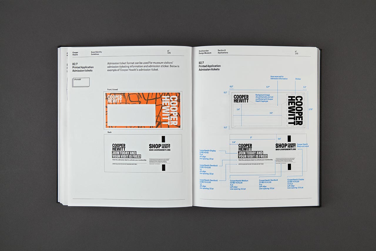
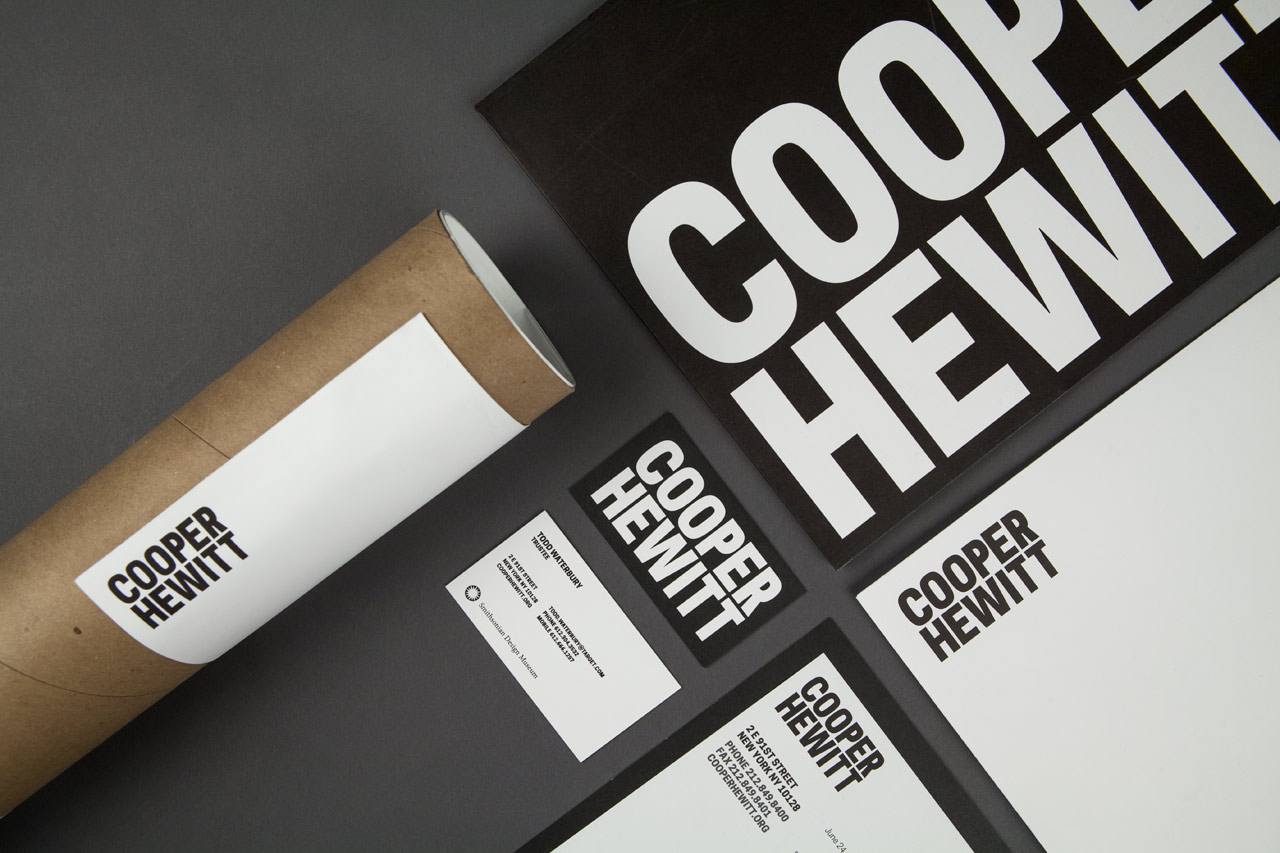
The Cooper Hewitt wordmark and typeface provide the strong but flexible foundation for a robust visual identity system. This is all outlined in a hefty 408-page style guide, handsomely packaged as a hardcover book one might find in the museum’s collection. The guide demonstrates how to apply Cooper Hewitt’s visual identity to every type of museum collateral, from letterheads, business cards, mailing labels, branded folders and envelopes, mailers, brochures, tickets, membership cards, wrapping paper and shopping bags to the exhibition labels, interactive tables, Design Journal and website.
The identity system is outlined in a 408-page style guide packaged as a hardcover book.
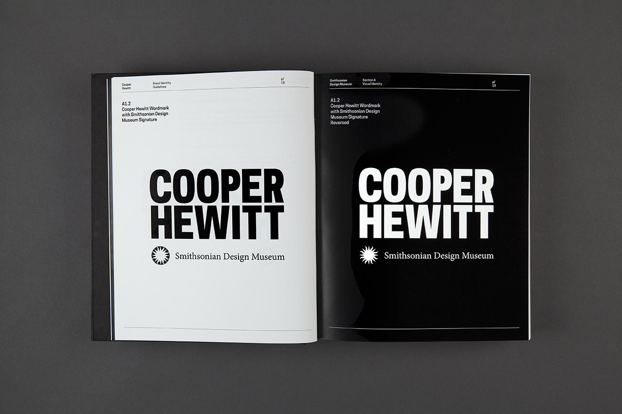
The wordmark can be reversed in coloration without losing its strong visual presence.
Guidelines for the placement of the Smithsonian Design Museum signature, which uses the Smithsonian’s existing identity. Distance between the Cooper Hewitt wordmark and the Smithsonian Design Museum signature can be defined by the content and medium.
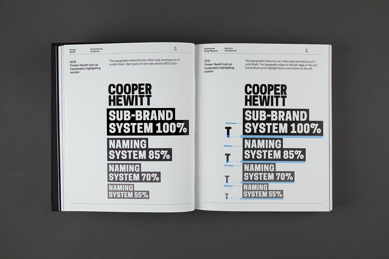
The clear and precise graphic system was engineered with a built-in flexibility that will allow it to expand over time as the museum introduces new programs. The various sub-brands are treated differently to create a diverse visual language. Primary sub-brands tied to events such as the National Design Awards, National Design Week and the People’s Design Award each have their own emblems, squares that are used in tandem with the wordmark. Identities for the museum’s physical and digital spaces—Shop Cooper Hewitt and Cafe Cooper Hewitt—appear as treated typography that works in balance with the logo, with the name placed all on one line and set to match the height of the wordmark. Secondary sub-brands for departments and programs such as Membership, Design K-12, Design Talks, and the Design Center are represented in a typographic cascading system, with the names and other content flowing in a scaled hierarchy below the wordmark. The typography can also be reversed out of a color block.
In addition to the primary palette of black and white, the program includes a secondary palette of 10 bright and modern colors. Some of these are used to represent various departments; for instance, orange accompanies membership and purple is used education. The sub-brands appear in the relevant color in the logo lockups, and the color is also printed on the back of departmental letterheads. Other stationery and collateral may incorporate collection images, or use the logo in patterns.
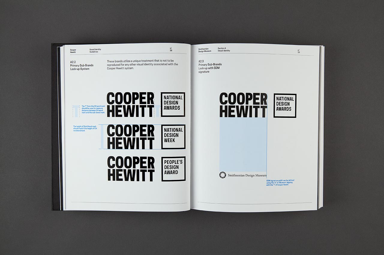
Primary sub-brands are locked up with the wordmark.
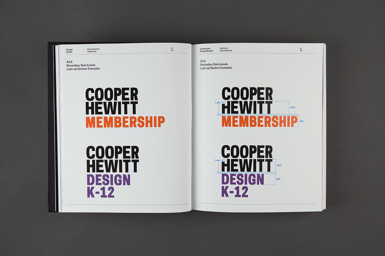
Logotypes for secondary sub-brands cascade below the mark and each have their own distinctive color.
Secondary sub-brands cascade from the logo, with the names and other content flowing in a scaled hierarchy below the wordmark.
The style guide demonstrates how to apply Cooper Hewitt ‘s visual identity to a wide range of collateral.
Where possible, the Cooper Hewitt wordmark is prominently positioned in the top left corner of applications.
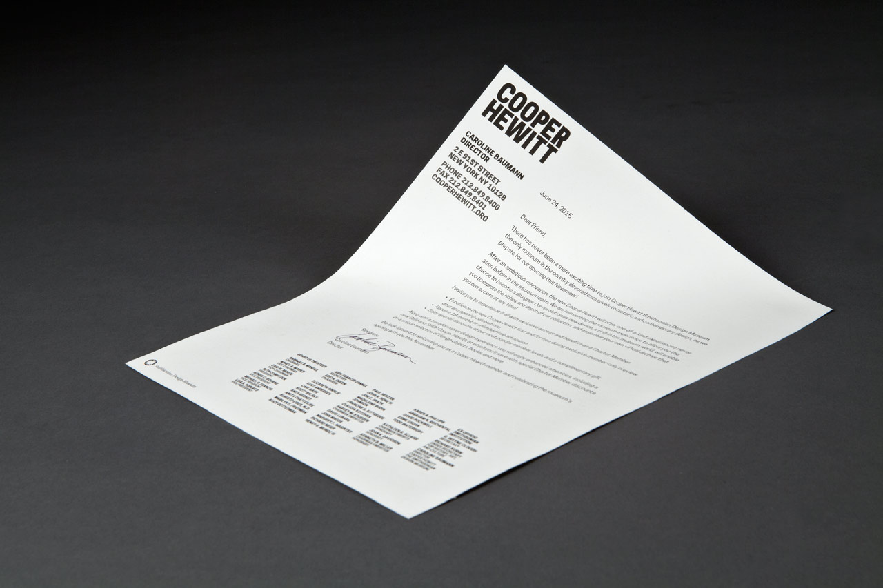
Letterhead.
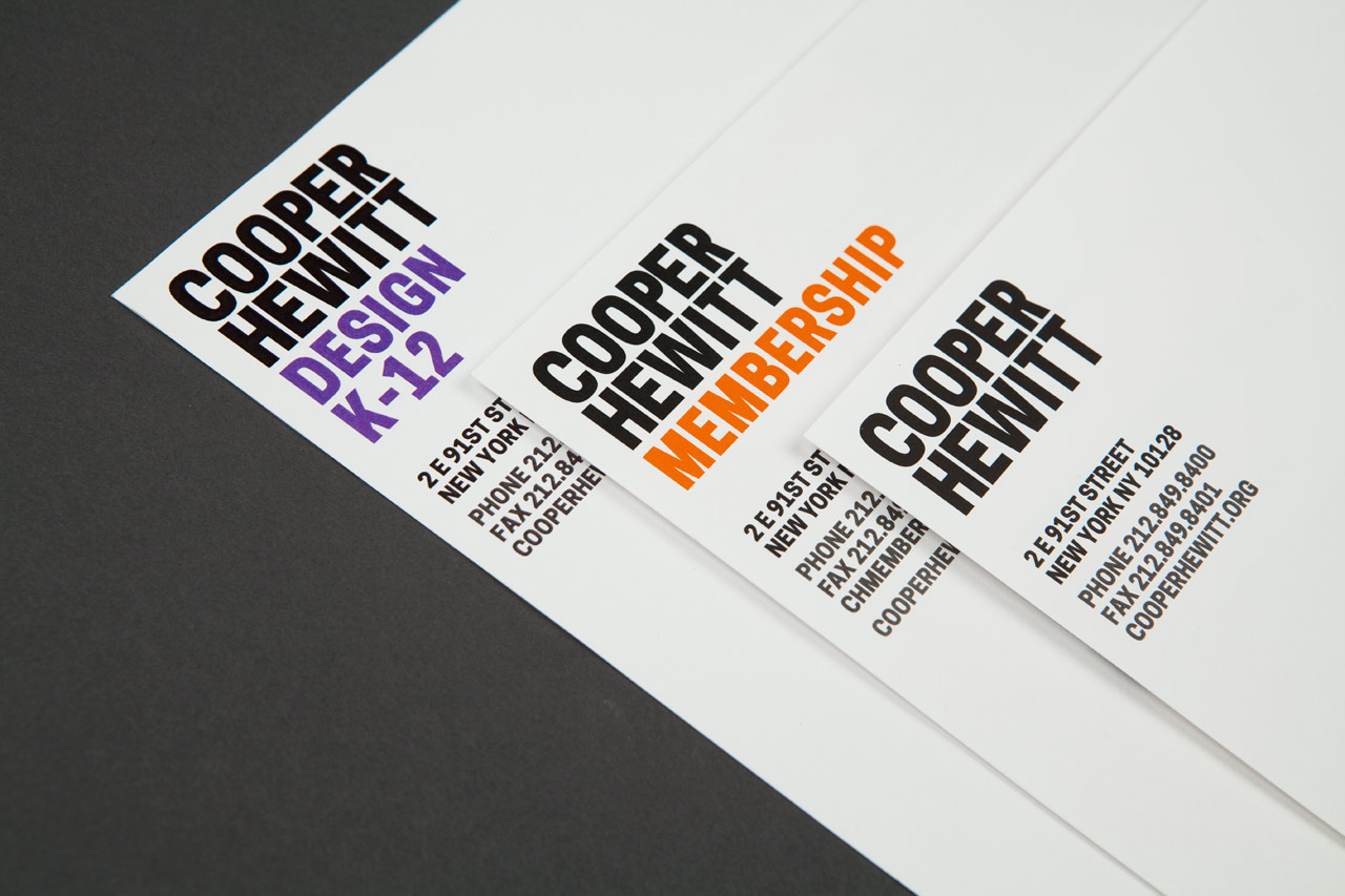
Sub-brands for different departments and programs appear in designated colors.
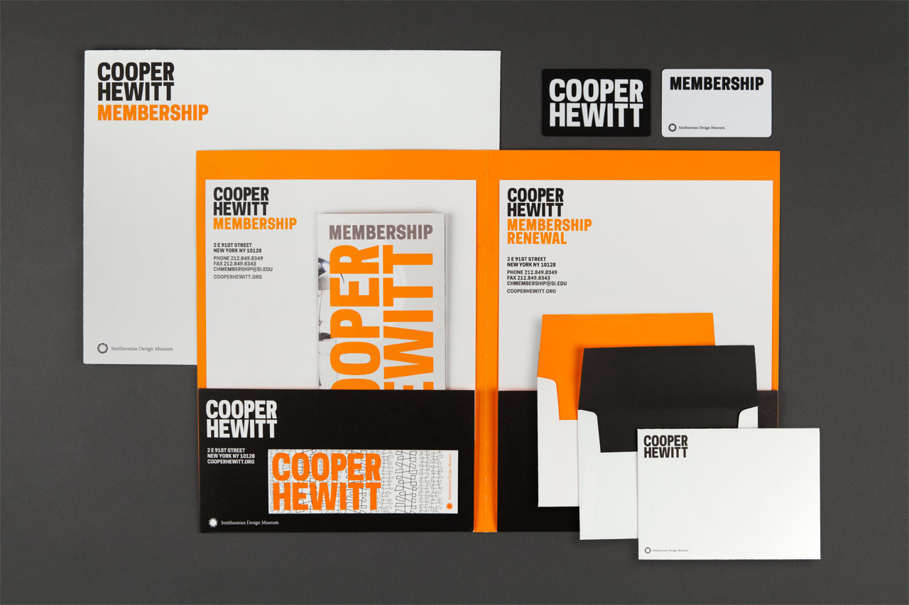
Membership materials.
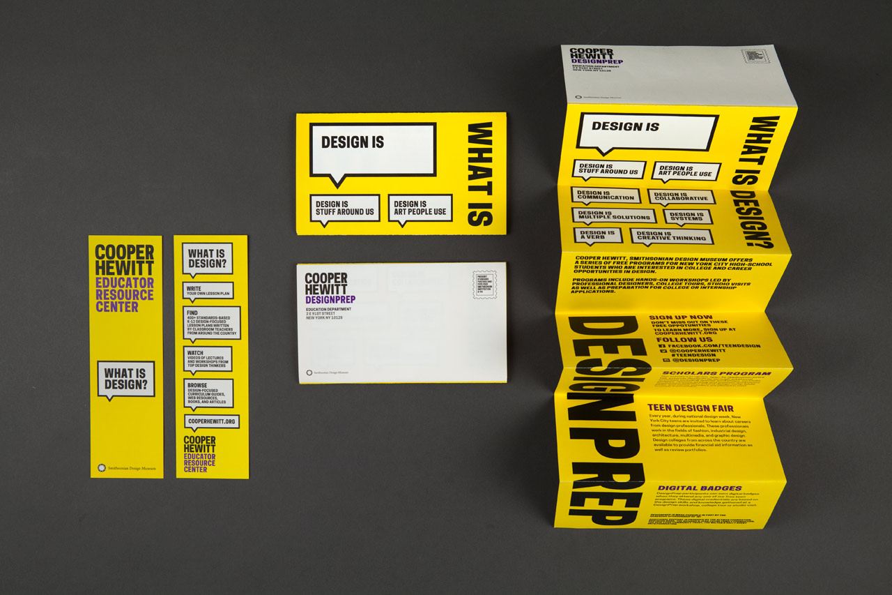
Graphics for the Cooper Hewitt Education Department Design Prep program feature the instructive tagline “Design Is…” and statements arranged in speech bubbles.
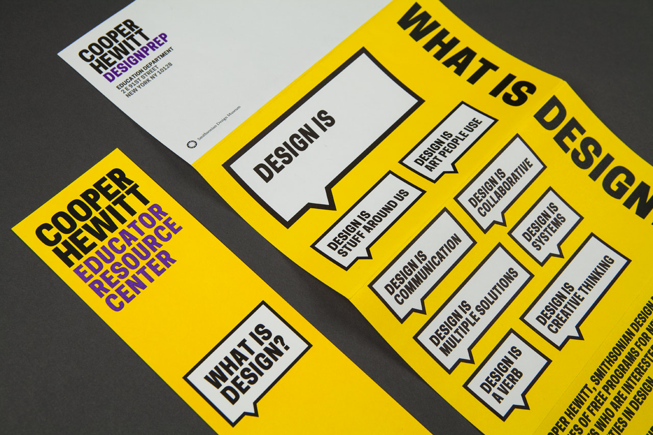
Design Prep mailer.
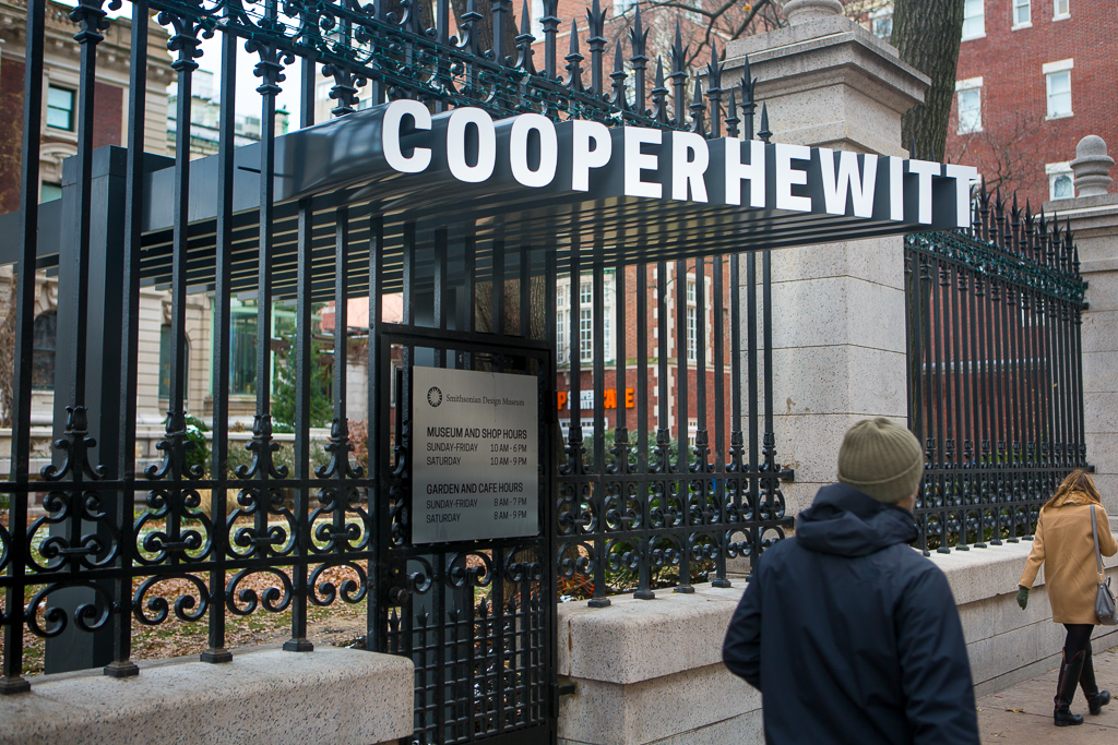
As part of the revitalization, Pentagram’s Michael Gericke and his team developed a vibrant system of signage and environmental graphics for the mansion’s exterior and interior. The program includes the exterior identity, exhibition directories, wayfinding and donor recognition graphics. The Andrew Carnegie Mansion is a historic landmark and cannot be physically altered, so the team found ways to creatively integrate the signage into the building in an impactful but non-intrusive way.
The designers collaborated with the project architects on ways to utilize environmental graphics to create a cohesive experience of the building. The renovation and expansion by Gluckman Mayner Architects and executive architect Beyer Blinder Belle transforms the mansion environment into museum-scale spaces, including a new gallery on the third floor that formerly housed the Cooper Hewitt library and back-of-house operations. Diller Scofidio + Renfro designed the casework and the initial configuration of the movable display cases for the exhibitions in the first and second floor galleries, the new visitor services desk, the new SHOP Cooper Hewitt and the new 90th Street entrance canopy.
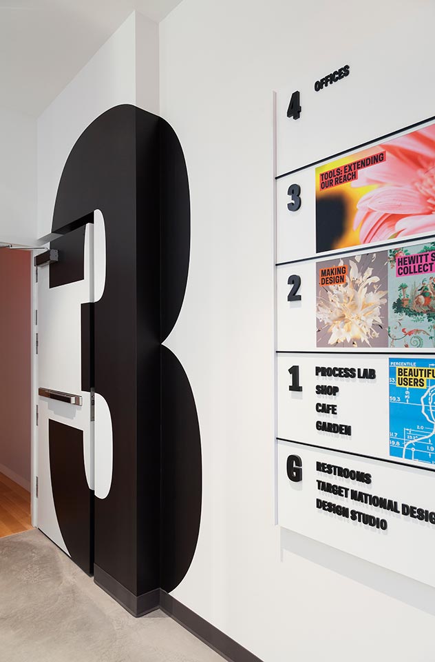
The signage and environmental graphics articulate the identity throughout the mansion, helping to establish the unique institutional personality and sense of place in the historic interior. Large-scale numbers identify the floors in the contemporary staircase that connects the different levels of the museum. At the new 90th Street entrance, the canopy designed by Diller Scofidio + Renfro features an extruded version of the wordmark passes through the landmarked fence without touching it. In the galleries, donor names float in front of walls and are cut from stainless steel, a modern counterpart to the mansion’s Gilded-Age elegance.
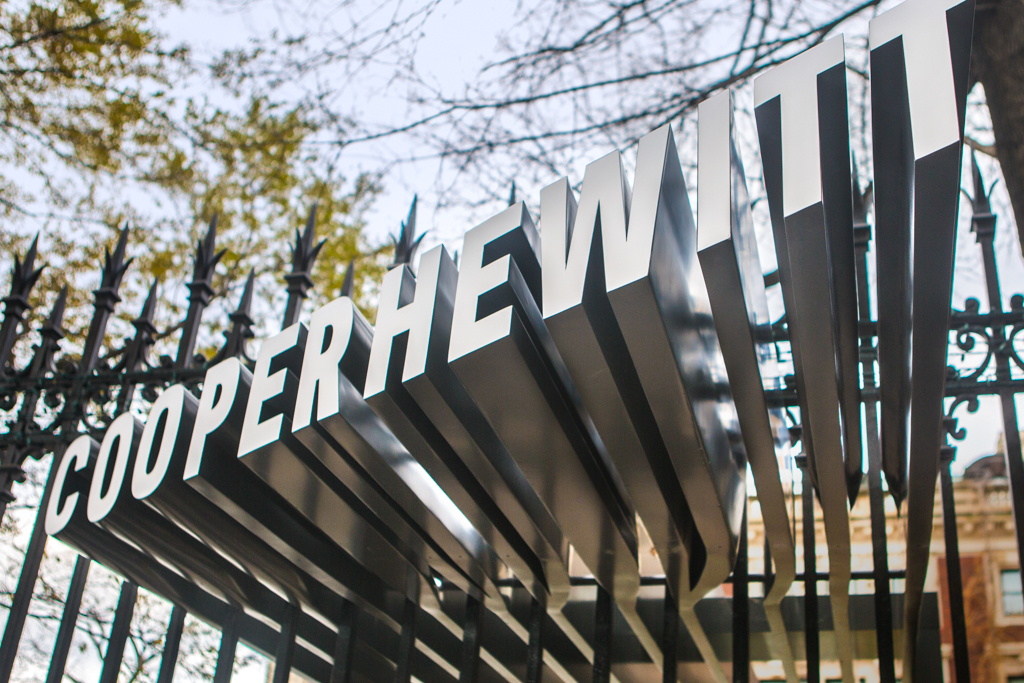
The canopy designed by Diller Scofidio + Renfro at the museum’s new 90th Street entrance features an extruded version of Pentagram’s Cooper Hewitt wordmark, set in the typeface developed in collaboration with Constellation.
At the museum’s 90th Street entrance, the canopy passes through the landmarked fence without touching it, and gestures towards pedestrians on Fifth Avenue.
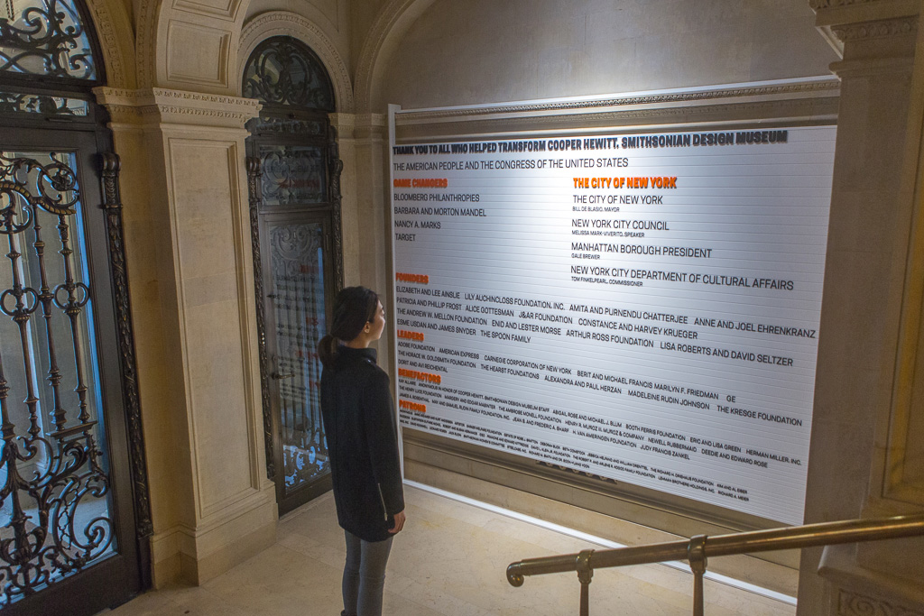
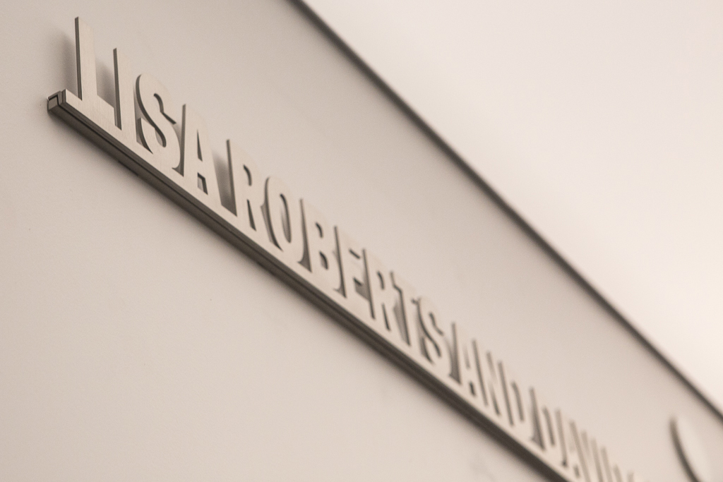
The donor wall at the 91st Street entrance is carefully suspended from the landmarked interior.
Modern materials set off the signage from the historic interior.
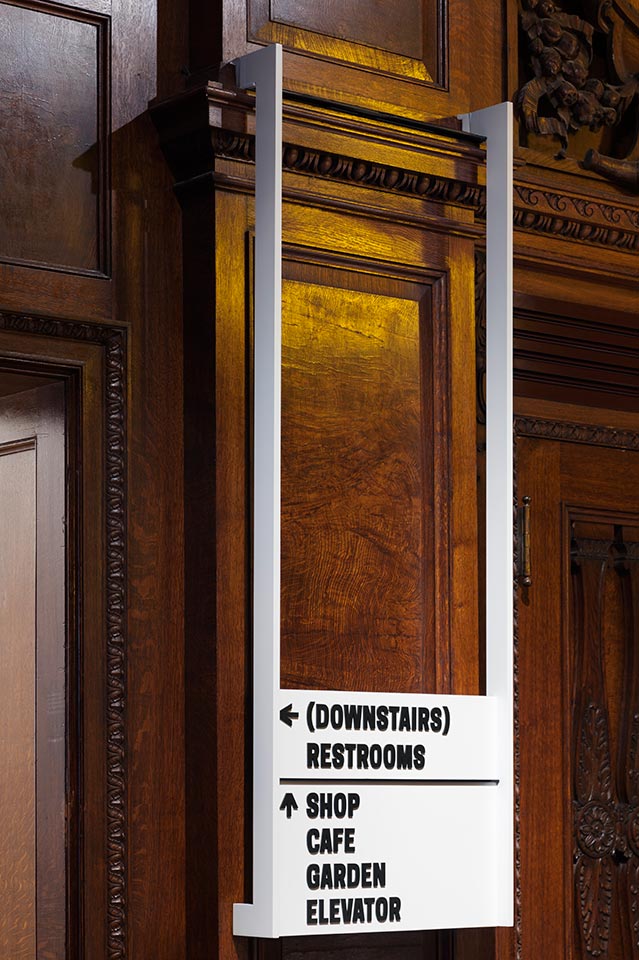
Interior wayfinding signage.
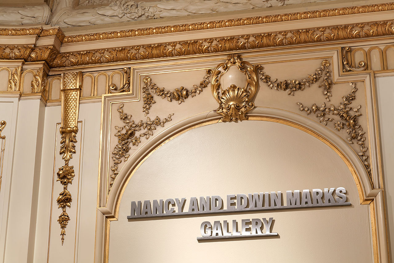
Gallery donor names float in front of walls and are cut from stainless steel.
Gallery donor signage.
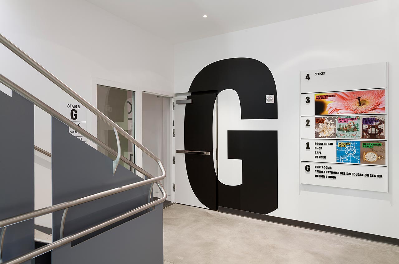
Large-scale graphics mark each level of the new contemporary staircase.
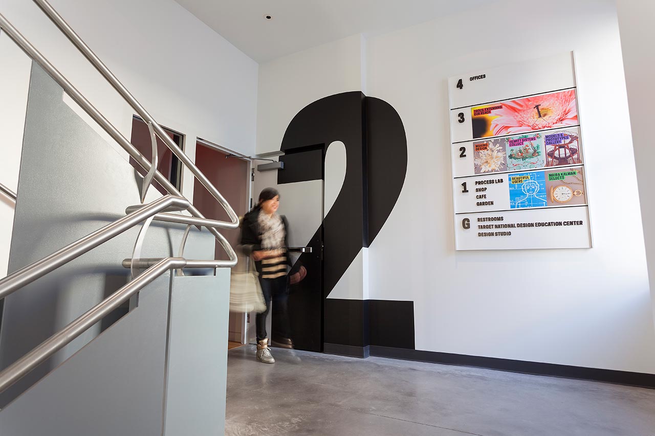
Colorful graphic directories, with changeable magnetic panels, highlight exhibitions on each floor.
Environmental graphics interact with the architecture.
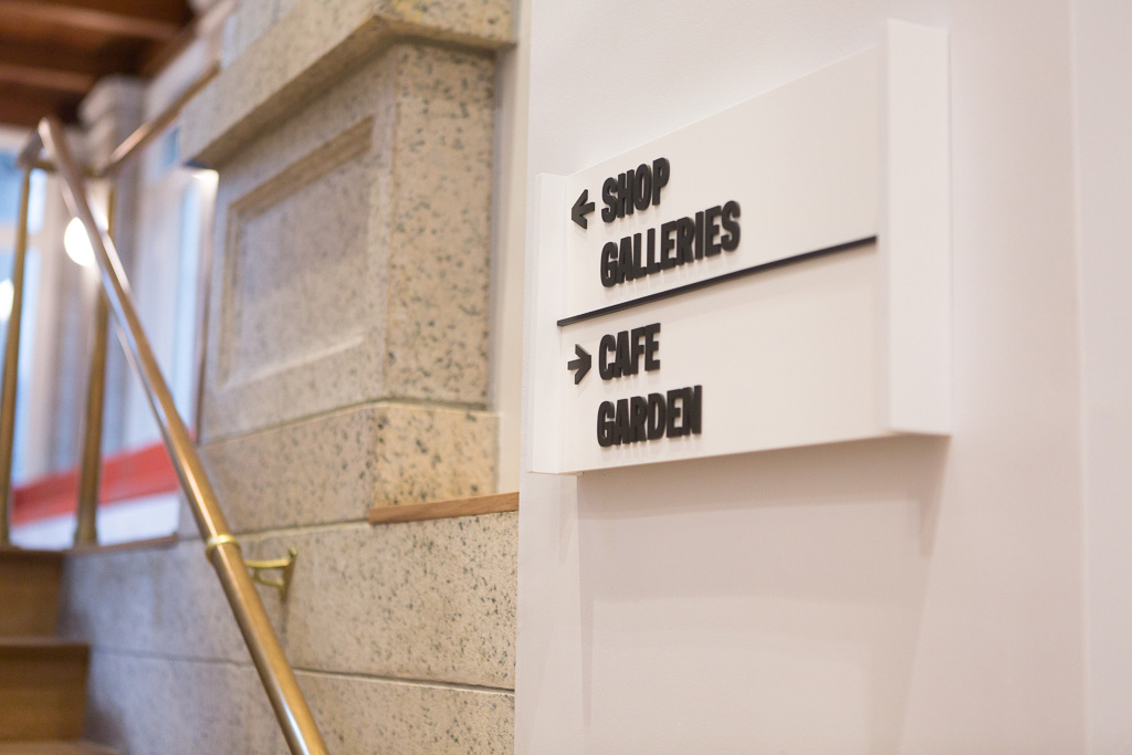
Museum wayfinding.
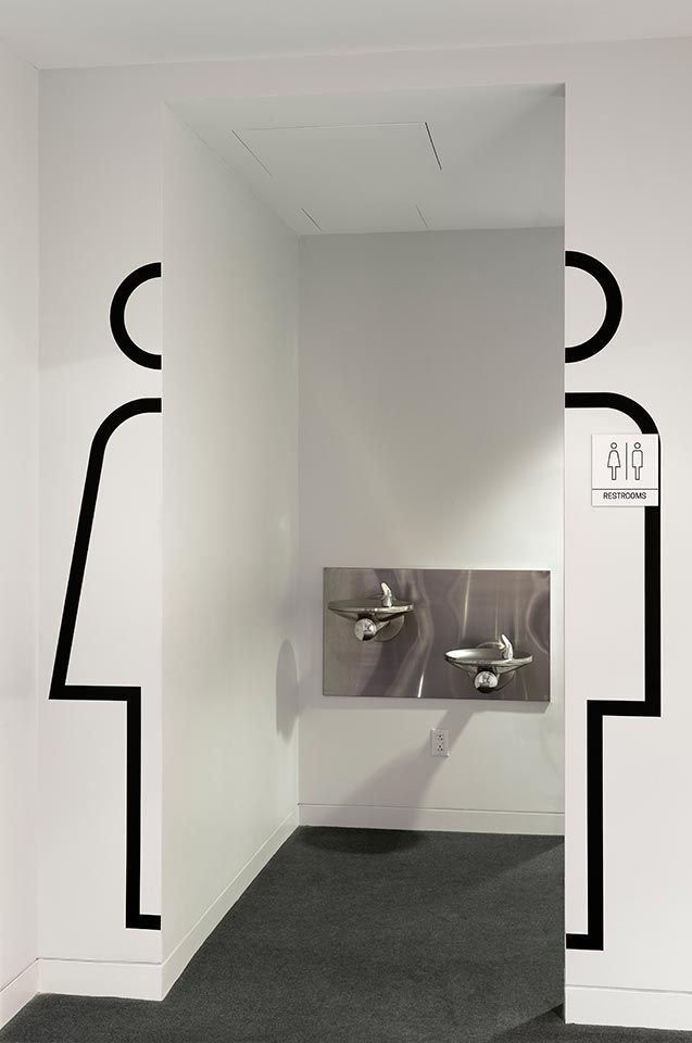
Easy-to-find icons for restrooms.
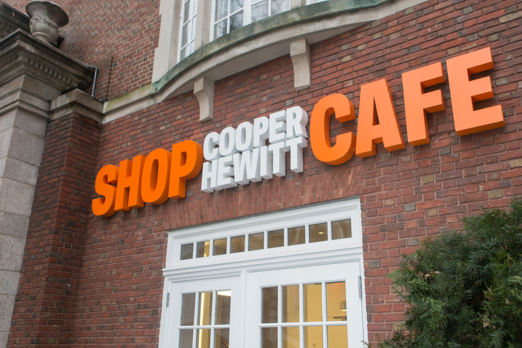
Dimensional signage at the entrance to Shop Cooper Hewitt and Cafe Cooper Hewitt.
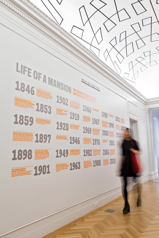
A timeline of the mansion’s history.
The signage is complemented by a system of exhibition graphics developed by Pentagram for the galleries, including display panels, wall text and labels. The Cooper Hewitt typeface becomes the medium for a lively, smart and friendly institutional voice that instructs and entertains.
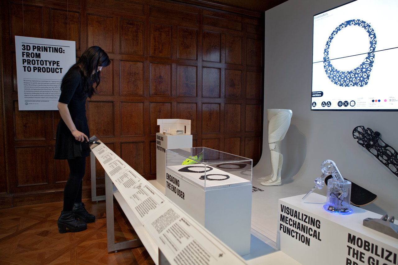
The designers also worked with the museum’s curators and educators to conceive the exhibits for the Process Lab, a new gallery that gives visitors the opportunity to experience the museum’s motto of “Play Designer” in a series of hands-on challenges that offer insight into the creation of a design. Designed appeal to the museum’s broad audience of adults and children, design neophytes and aficionados alike, the fun displays invite visitors to try their hand at activities like brainstorming, prototyping with light (in a station designed by Lindsey Adelman Studio) and interacting with different materials. The final display asks participants to rate their new design skills on a wall-size infographic, from Novice to Ninja.
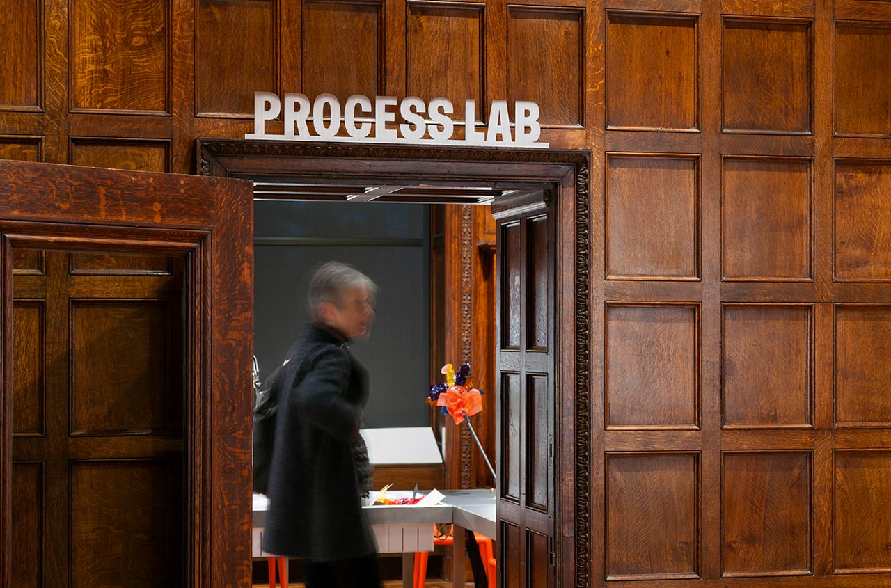
Entrance to the Process Lab, a new gallery that invites visitors to play designer.
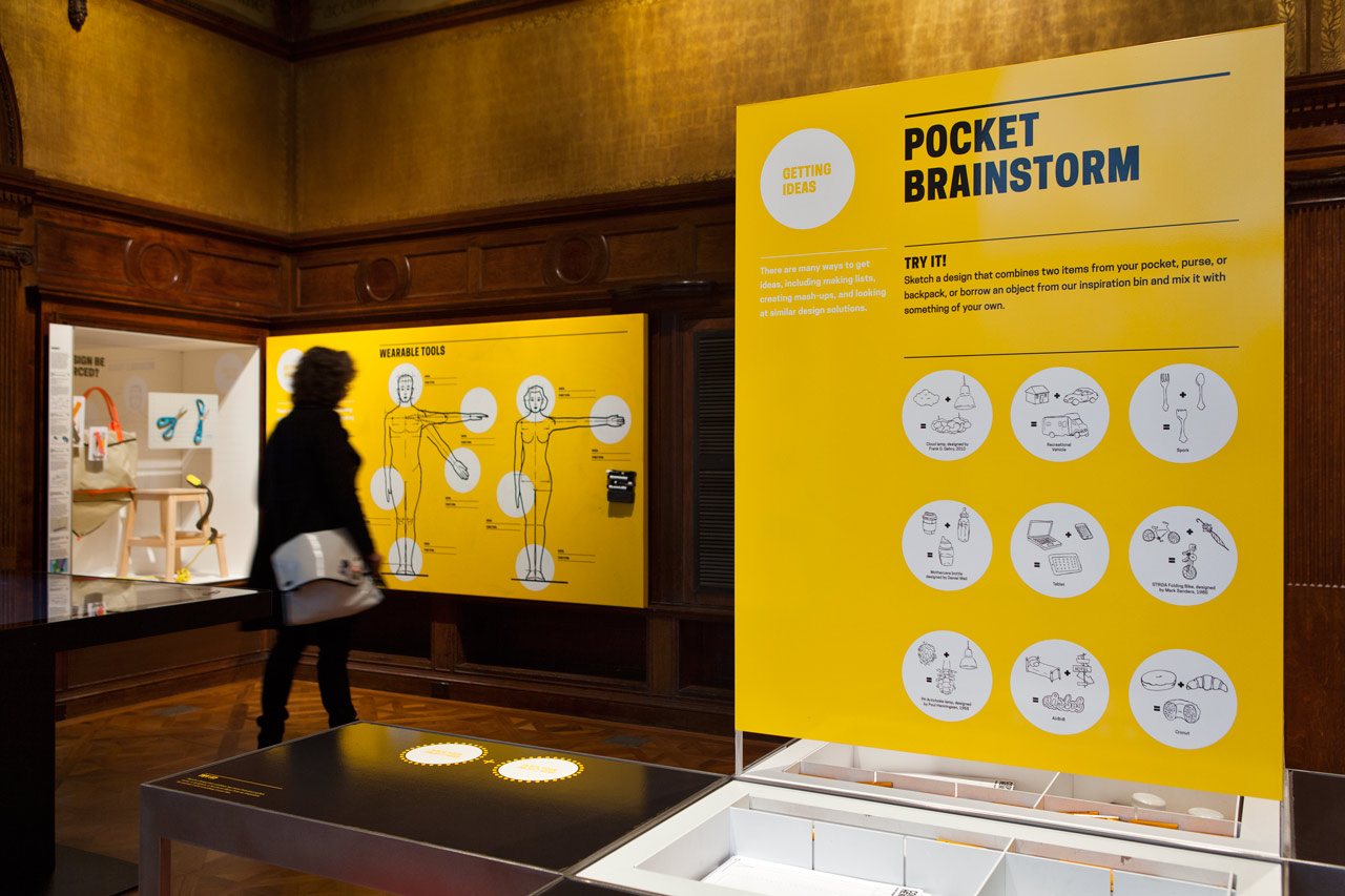
Pentagram collaborated on the design of the exhibits in the Process Lab, which present a series of hands-on challenges.
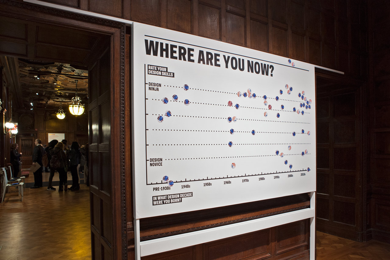
Infographic asking visitors to rate their design skills.
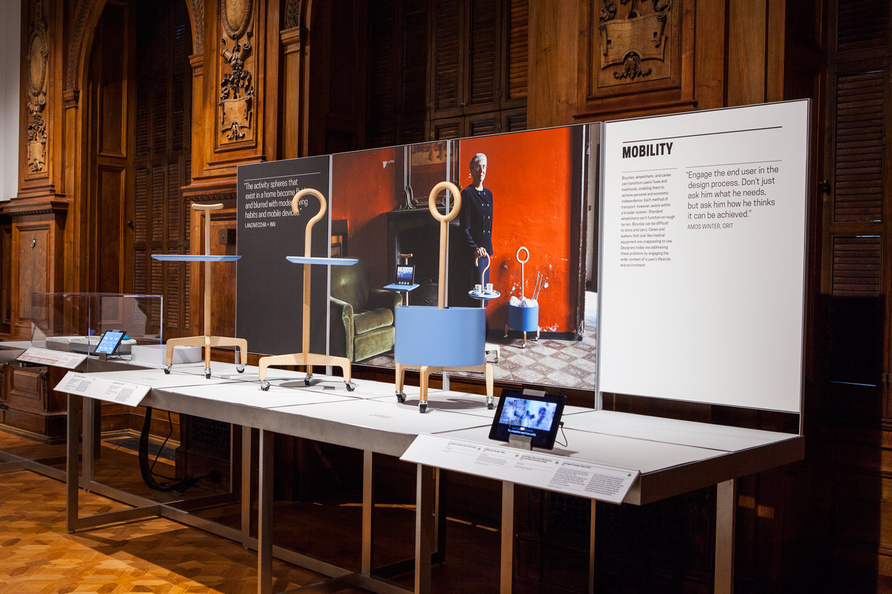
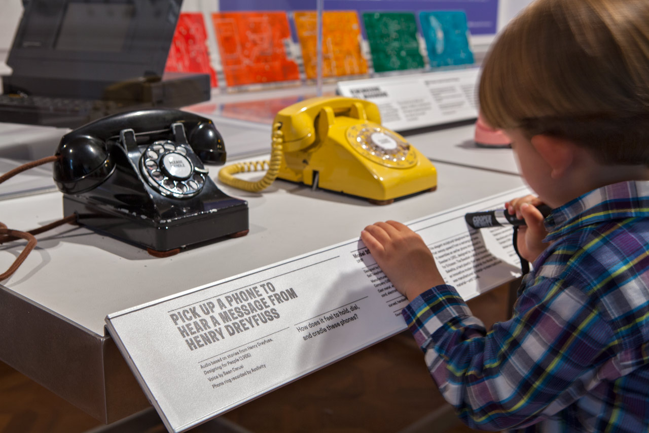
In the museum galleries, display panels start a dialogue about the featured objects, providing background on their design and context for their use.
Central to the experience of the relaunched museum is the Pen, an innovative tool that allows visitors to “collect” objects they encounter in the galleries for further exploration. Local Projects and Diller Scofidio + Renfro worked with the Cooper Hewitt and several technology firms to develop the platform, which includes a system of nine digital touchscreen tables—one large 84-inch table in the museum’s great hall, and smaller tables in the major galleries—where visitors can view and interact with the artifacts they’ve gathered. They can also take the objects home with them via a custom URL printed on their ticket. (The system helps generate useful data on how visitors experience the museum and its collections.)
Pentagram collaborated on the design of the interface for the Pen and tables, creating a full system of custom icons that builds on the visual language of the identity, including the “COLLECT” plus sign that indicates access for Pen collections. The Pen uses an NFC (Near Field Communications) sensor that reads information in a NFC tag chip embedded in the object labels in the galleries. Touching the pen to the crosshairs of the “COLLECT” symbol on the labels adds the item to the visitor’s holdings.
The Pen platform deftly bridges the physical and digital spheres, employing tools commonly used by designers (pen and desk/table). The Pen can be used to draw on the surface of the tables, where visitors can build on the forms of the items they collect to create new objects and patterns. The system also ties into the work of Cooper Hewitt Labs, the museum’s in-house tech team, who have been leading an effort to digitize the museum’s archive of more than 200,000 objects.
As part of the exhibition graphics, the Pentagram designers worked with the curatorial team on how to structure the labeling system for objects in the galleries. These are organized in the simple baseline grid of the identity, with different formats for the various display types such as vitrines and platforms. In addition to standard information like title, date, designer and medium, the labels include descriptive tags that are also used to sort the artifact on the website and digital collection. (For instance, words like “irregular,” “looped” “unexpected shapes,” and “seating” are used to describe a Campana Brothers chair.) Objects grouped in displays are represented by outlines for easy identification.
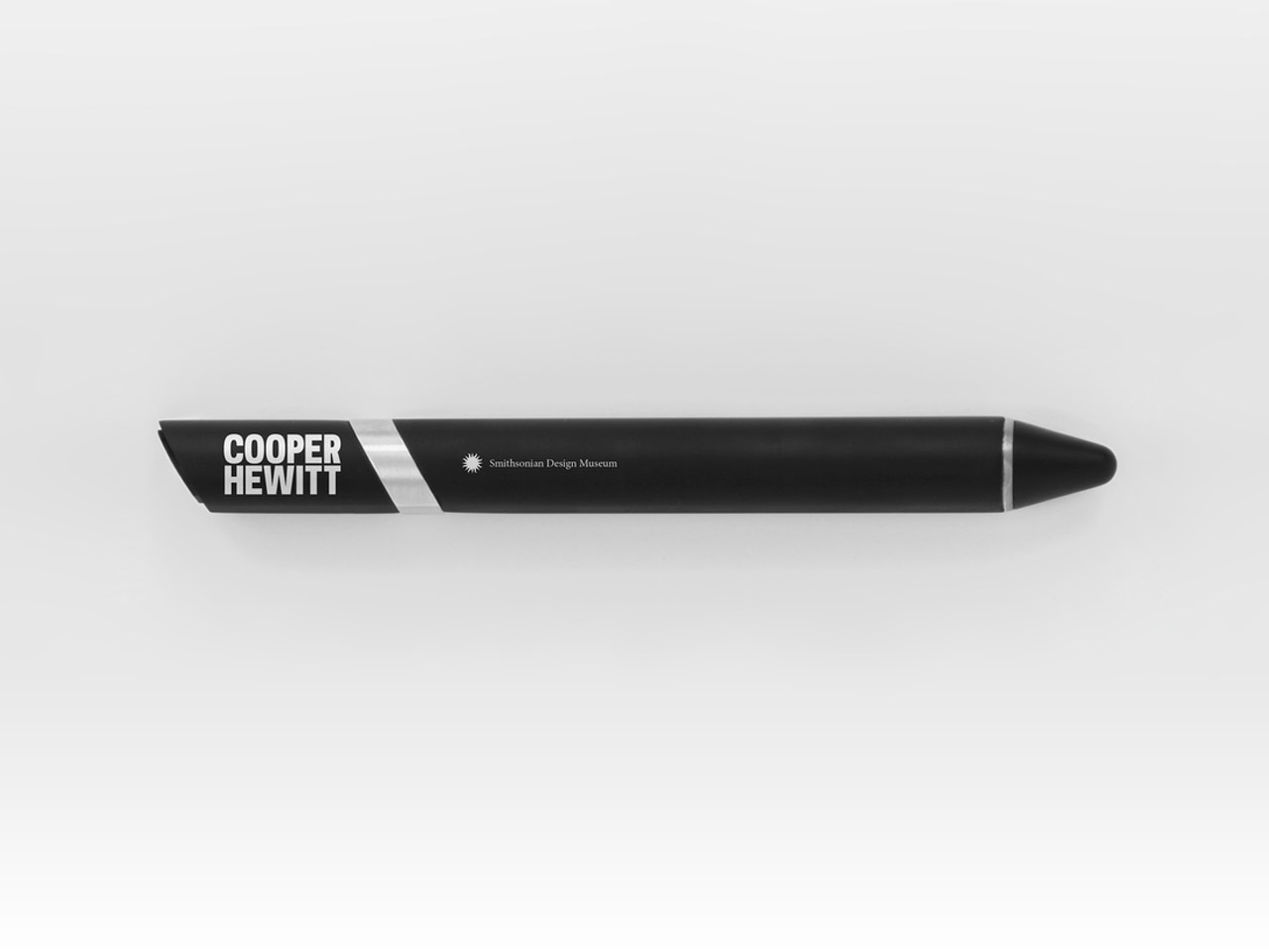
The interactive Pen, a tool that gives visitors the opportunity to explore the collection in a new way.
The Pen is used to “collect” objects encountered throughout the museum.
Visitors touch the pen to the crosshairs of the “COLLECT” plus sign on the object labels to add the item to their collections.
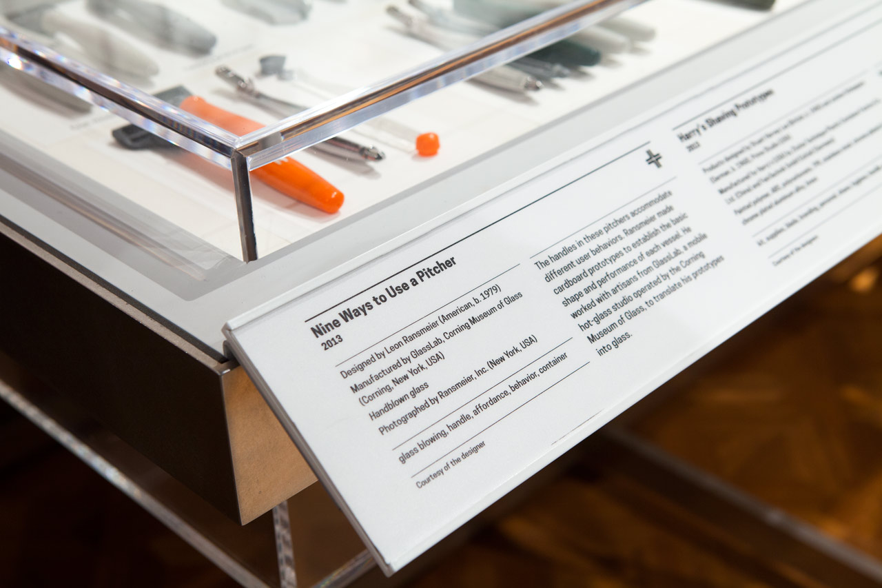
The designers worked with the curators to organize information on the display labels.
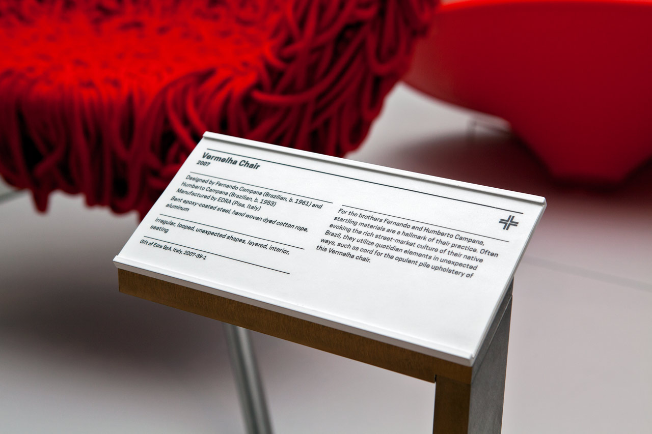
In addition to standard information like title, date, designer and medium, the labels include descriptive tags that are also used to classify the object on the website.
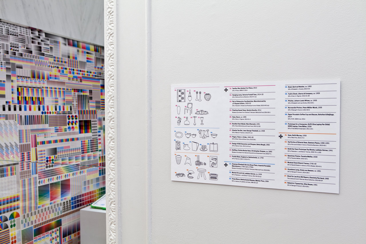
The designers developed a system to identify objects in grouped displays.
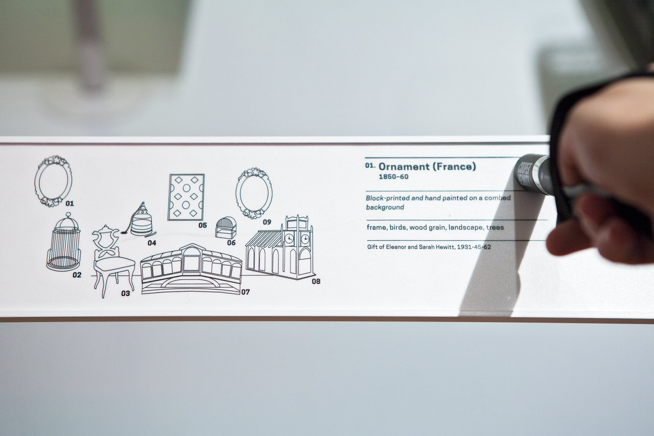
Displayed objects are represented by simple outlines.
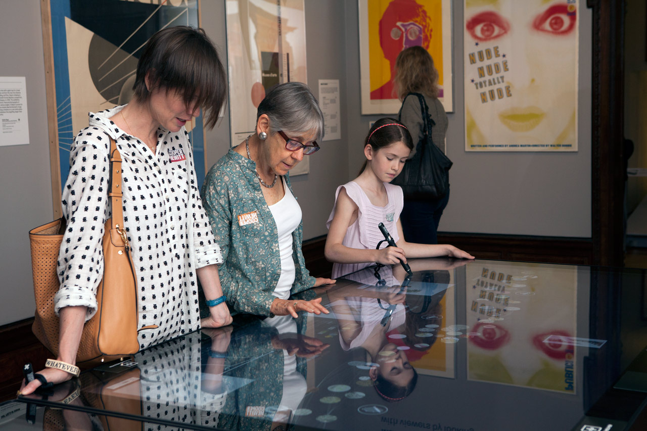
Visitors can interact with the in-gallery digital tables using the Pen or through touch.
Icon system for the interactive tables.
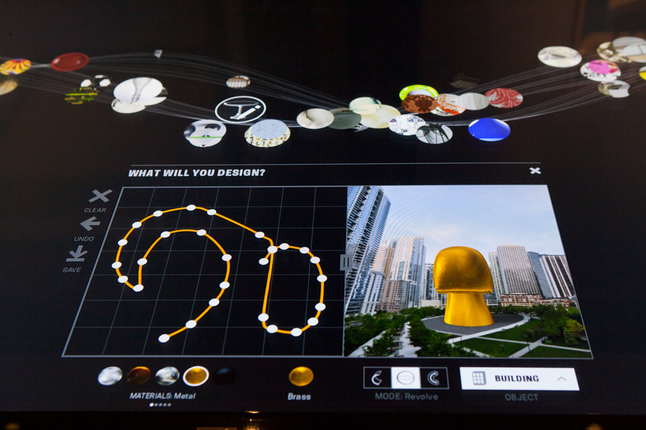
The digital tables give visitors the opportunity to explore the collection objects and create their own designs.
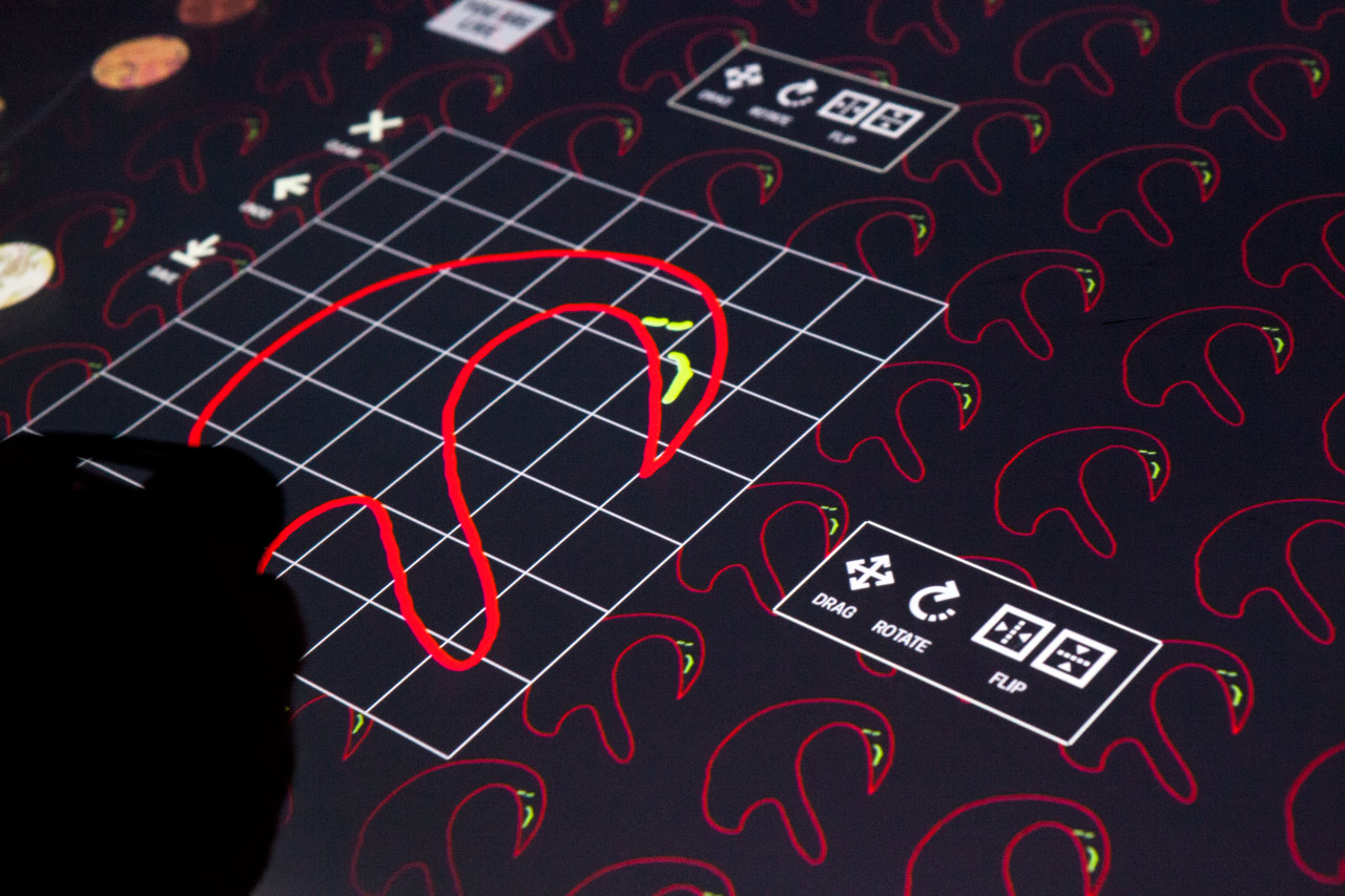
Using the Pen, visitors can draw their own designs and save them.
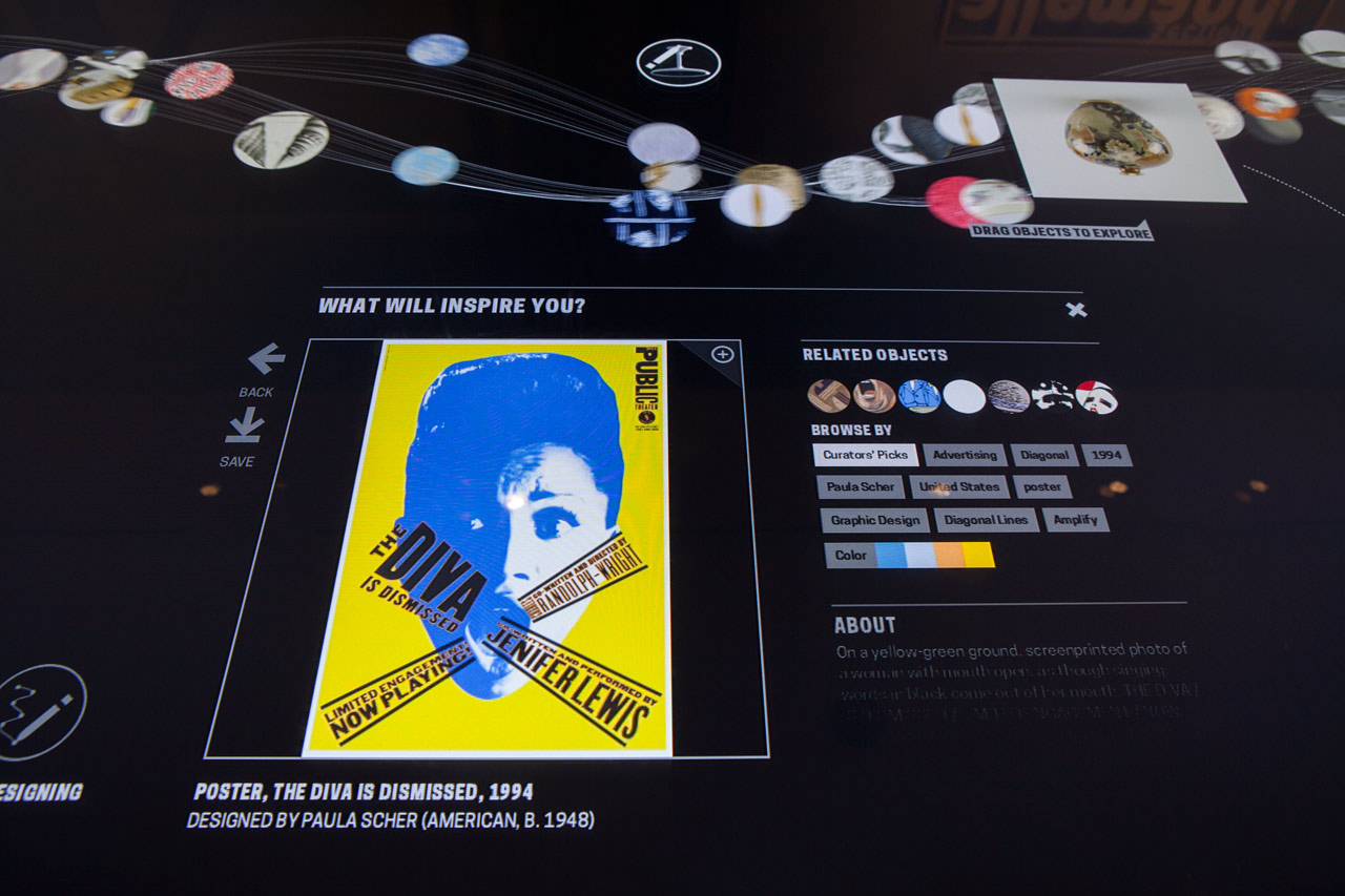
Visitors can interact with objects including Paula Scher’s The Diva Is Dismissed poster for The Public Theater.
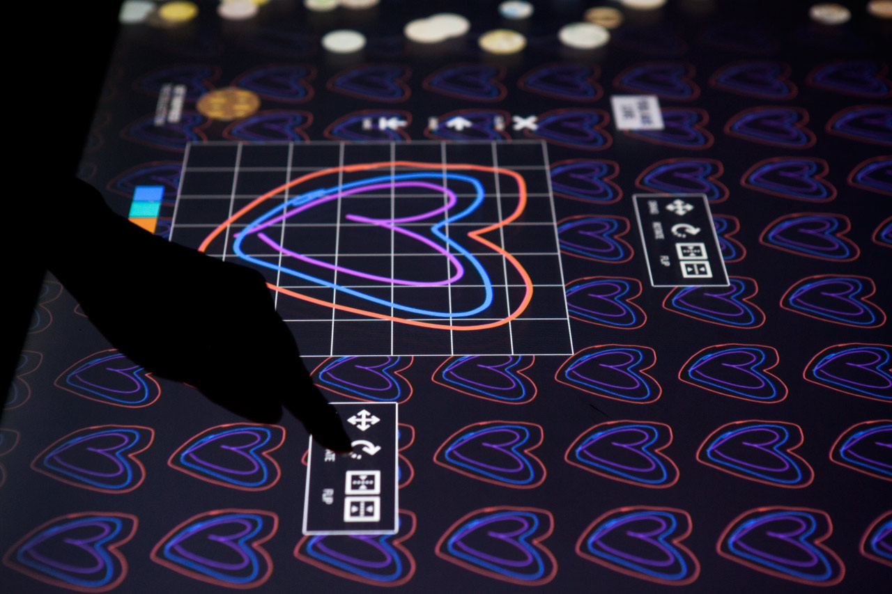
Using the Pen, visitors can draw their own designs and save them.
Opara and his team also redesigned the Cooper Hewitt website with a streamlined format that complements the physical transformation of museum and serves the expanding digital needs of the institution. Optimized for mobile devices, the design makes Cooper Hewitt’s activities, collections, programs and content easily accessible to visitors. The site was implemented in WordPress by Matcha Labs, in conjunction with the museum’s in-house digital team.
Like the Pen, the site offers another way to experience the museum’s fantastic permanent collection (currently 92 percent is accessible, with more objects continually added). Artifacts are tagged by metadata, and in addition to year, medium, department and object type, can be explored by more esoteric criteria such as color and size.
The site’s design represents a visual advance over the conservative look of other Smithsonian Institution sites. On the homepage, a pattern of colorful images, each providing access to a different area of information, are tiled in a flexible six-column grid. The site is easily navigated via an ever-present header and footer, each with a main and sub menu. As in the identity, color is used as an organizing element for individual sections like Publications and Videos.
Homepage of the Cooper Hewitt site.
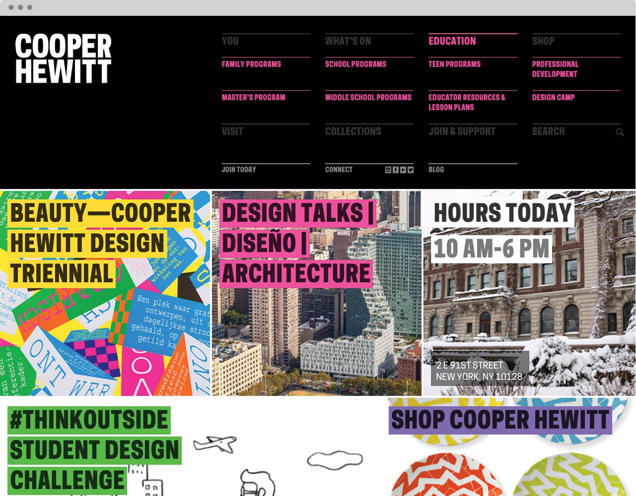
The design of the site is a departure from other Smithsonian Institution sites.
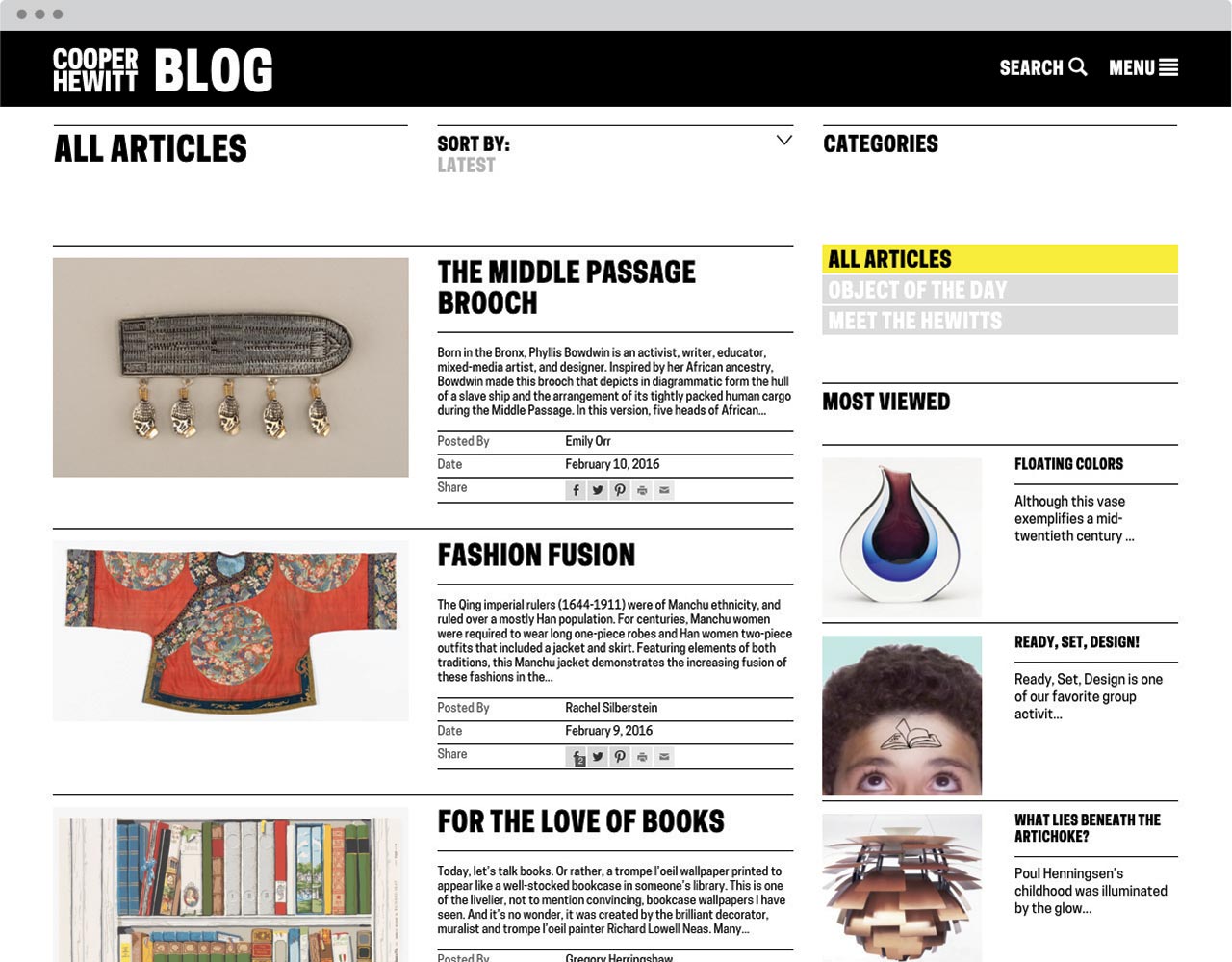
Blog.
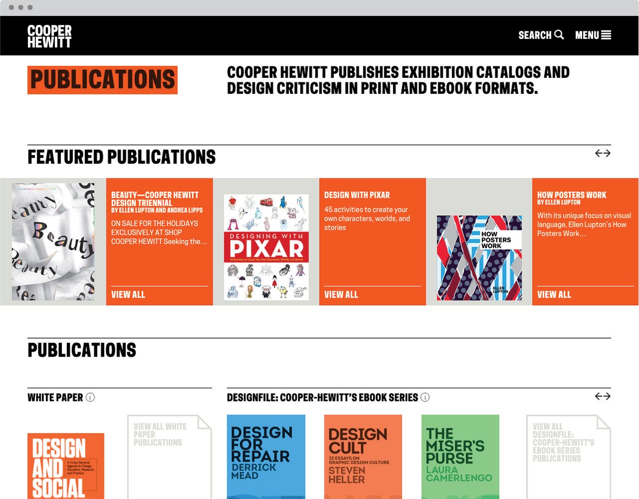
Publications section.
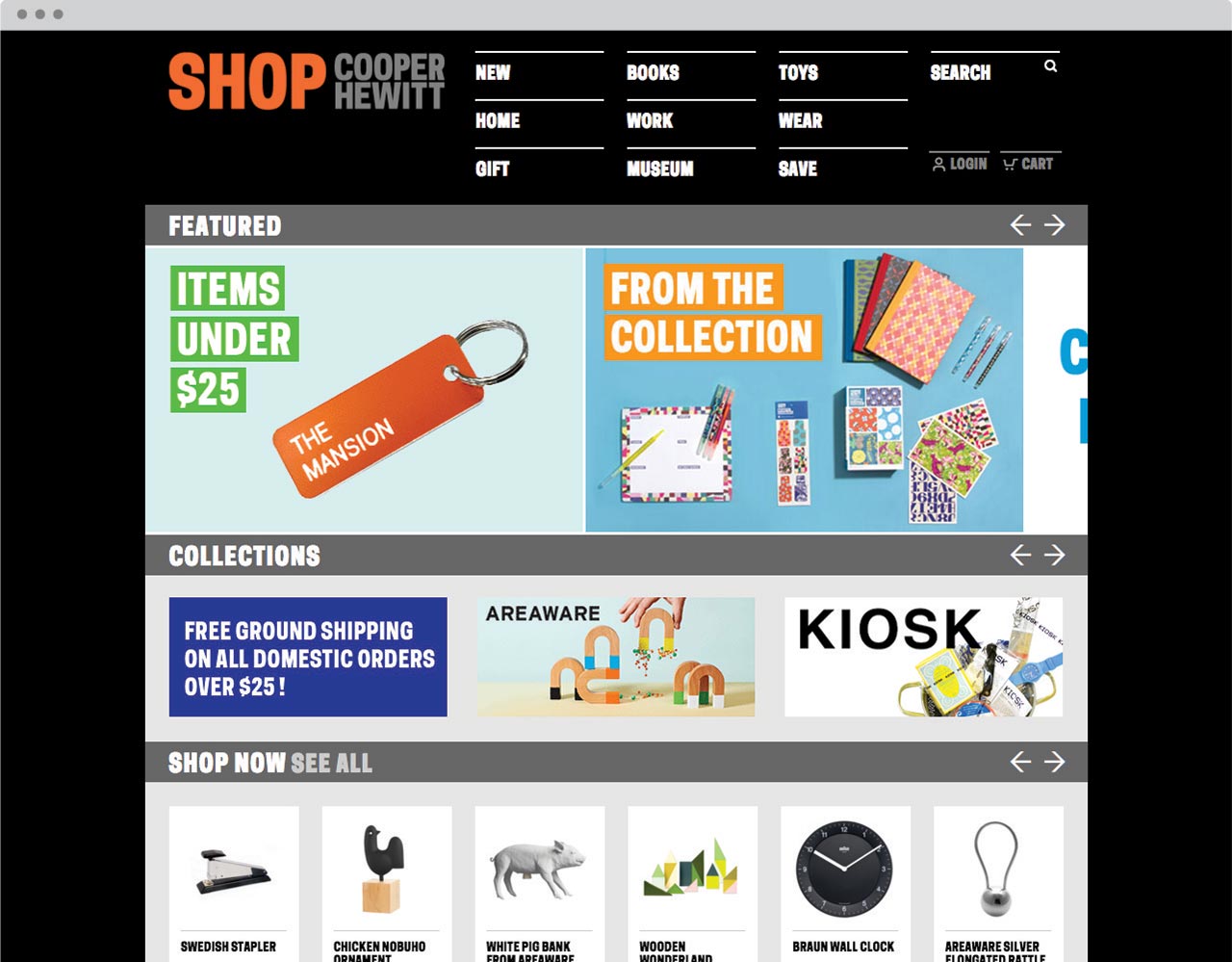
Online shop.
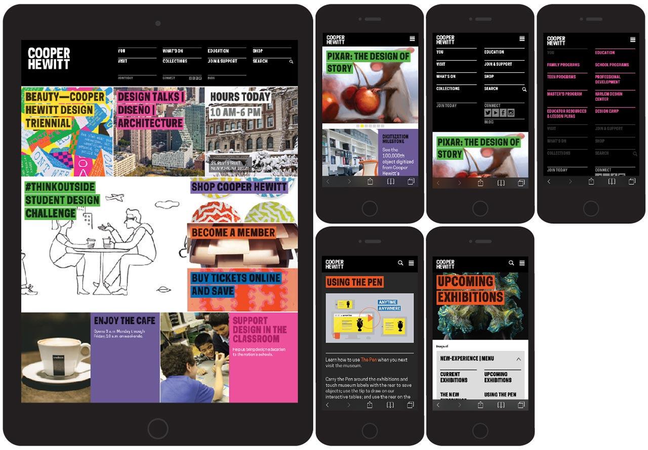
Mobile version of the site.
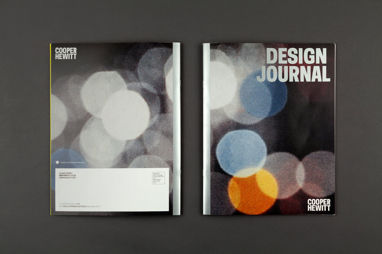
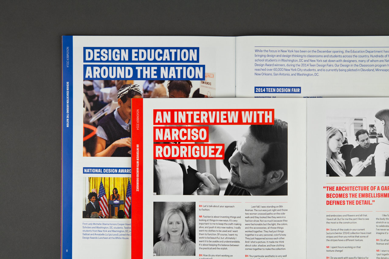
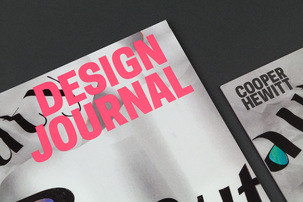
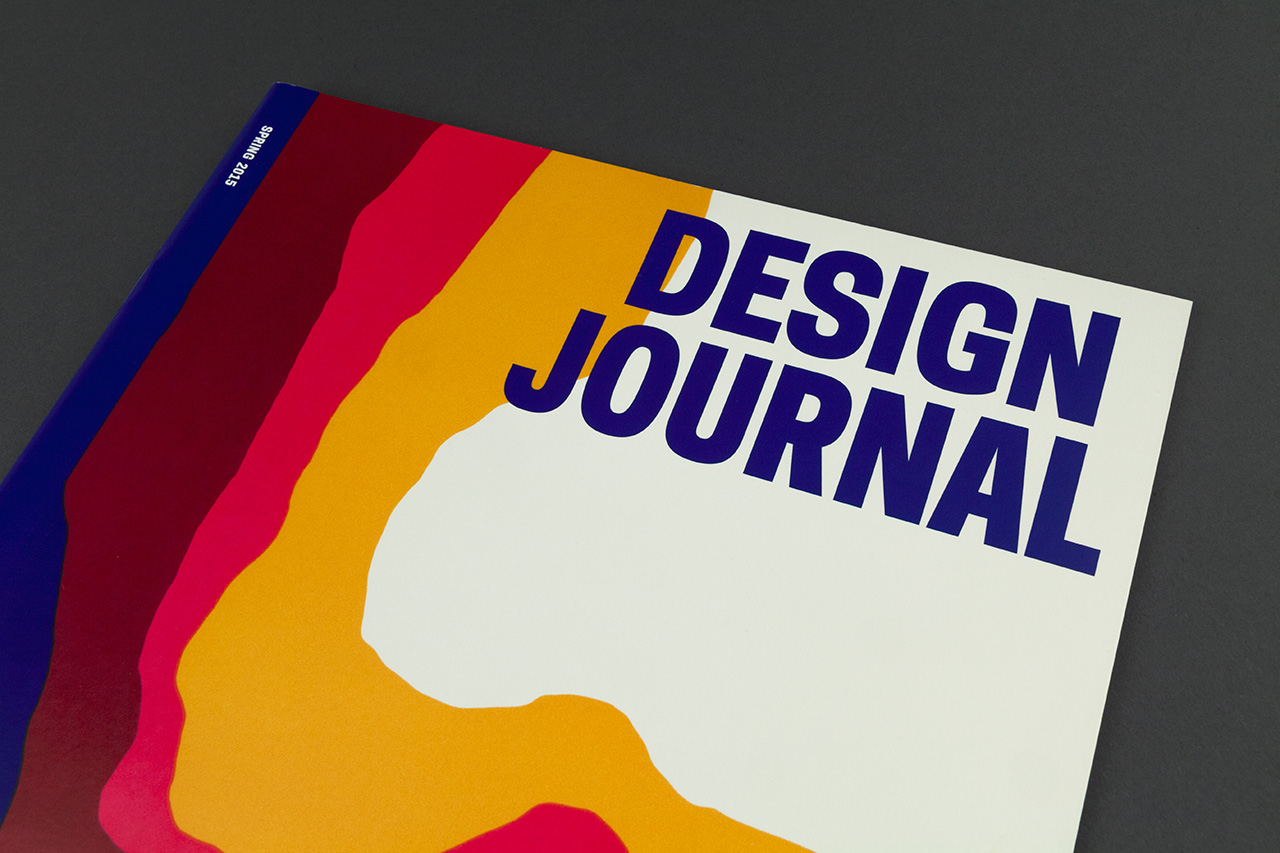
One of the most important communication initiatives was the redesign of Design Journal, the museum’s newly named biannual magazine. The design team reimagined the publication within the framework of the new identity, introducing a spirit of boldness in line with the focus on design innovation. The new magazine has larger dimensions, more images, and a stronger use of color, and is printed on FSC-certified recycled paper. The editorial structure is simultaneously more fluid and precise, with a flexible six-column grid structure that can be combined in a variety of ways to accommodate content that ranges from individual stories and interviews, to notes on programs and future events, and a portfolio of recent acquisitions.
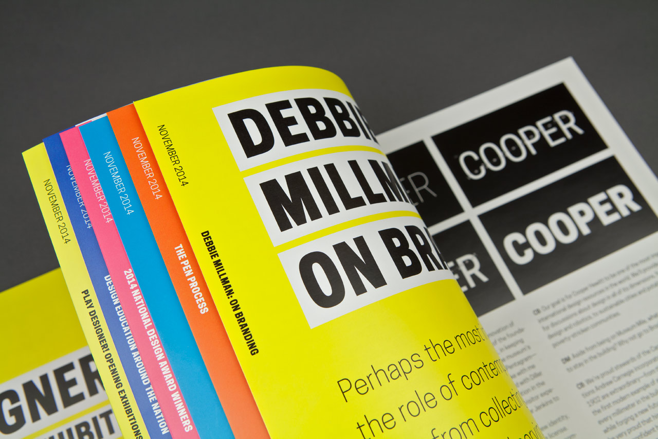
The clean, crisp layout echoes the methodical nature of the identity. Color is employed as an organizing element throughout the magazine; the sidebar of each section has a designated color from the secondary color palette. For example, feature articles are indicated with yellow and use a two-column grid. Following the launch issue designed and developed by Pentagram, subsequent issues have been designed by the Cooper Hewitt in-house design team, who have brought the format to life. Back issues of Design Journal can be downloaded for free here.
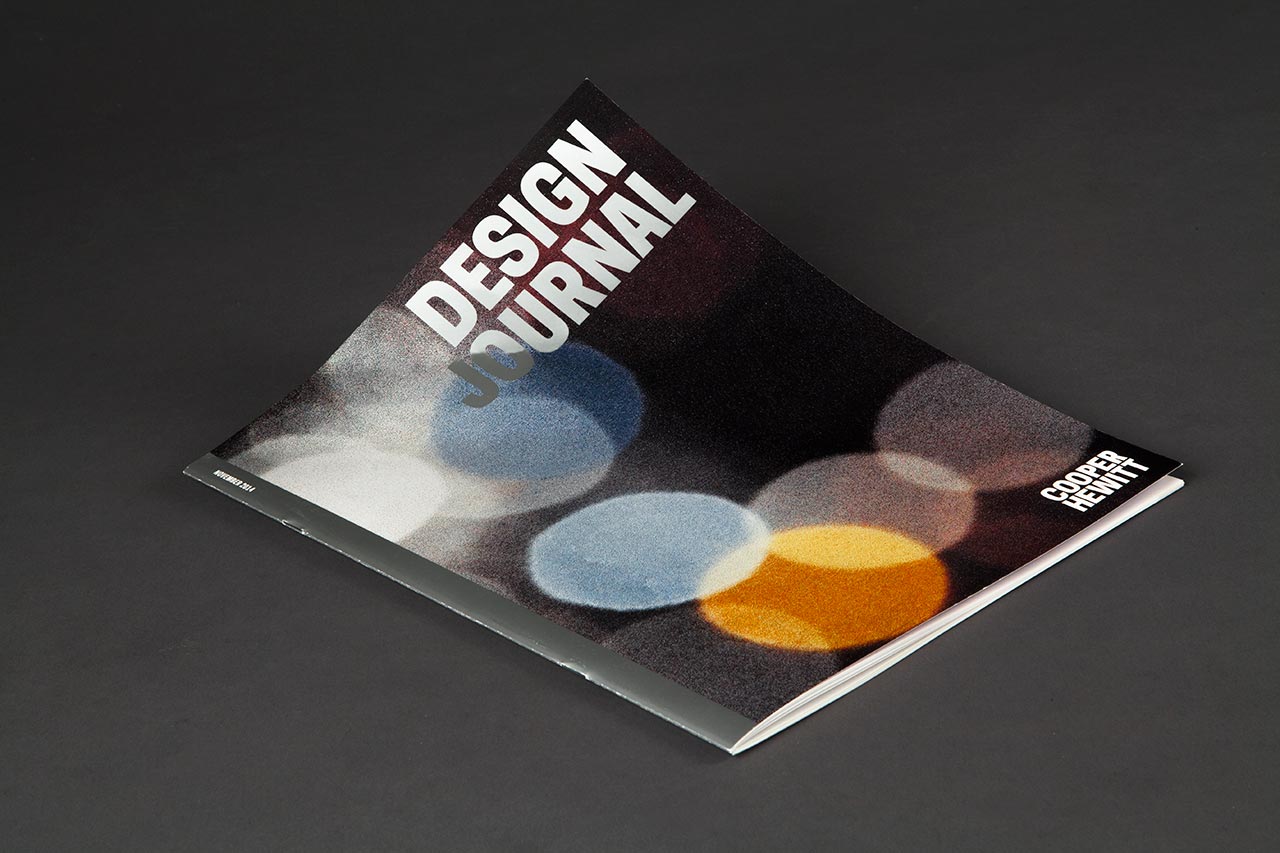
First issue of the redesigned Design Journal.
The front and back cover feature a detail from Grethe Serenson’s Rush Hour 2/ Shanghai, a 2012 textile design recently added to the collection.
Color is employed as an organizing element throughout the magazine.
The redesign features a flexible six-column grid structure that can accommodate a range of content.
In non-feature spreads, headlines match the article’s sidebar color.
Cover of the Fall 2015 journal featuring the Beauty exhibition. Design by Cooper Hewitt.
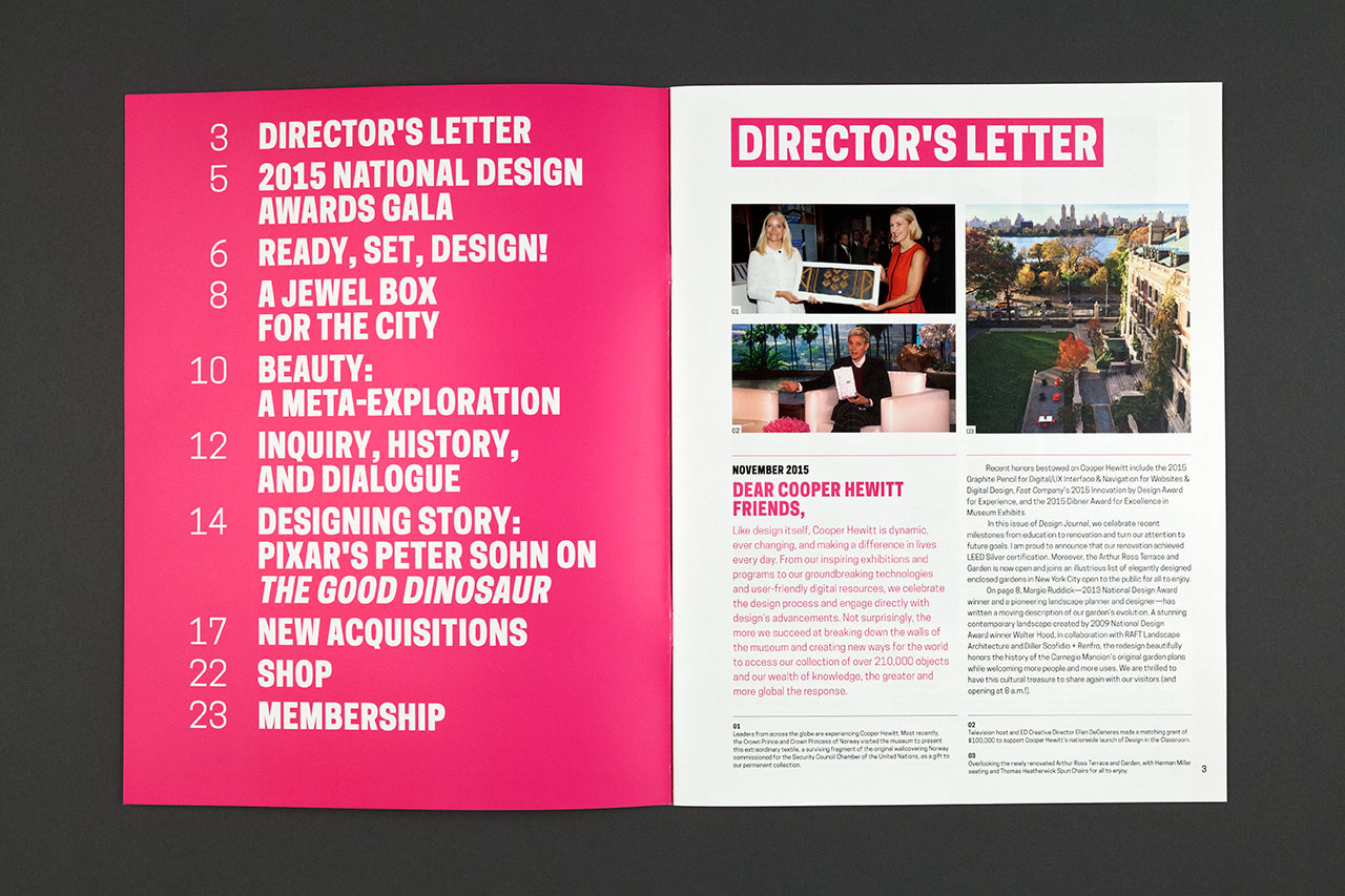
Fall 2015 journal. The table of contents always appears on the inside front cover. Design by Cooper Hewitt.
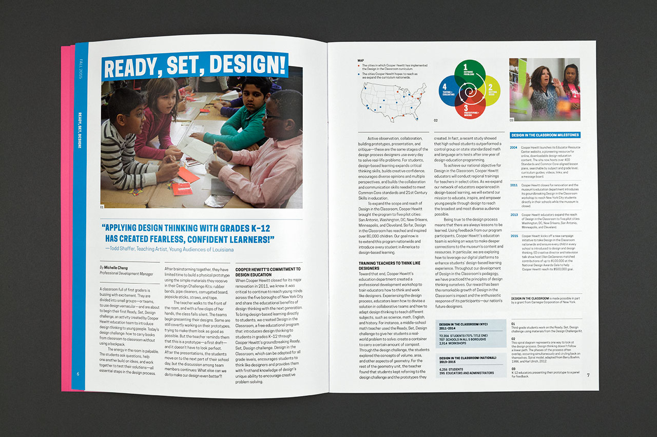
Educational features are keyed to blue. Design by Cooper Hewitt.
The secondary palette of the identity is used as a system of color. Design by Cooper Hewitt.
Cover of the Spring 2016 journal featuring a detail from a 1972 poster for Herman Miller. Design by Cooper Hewitt.
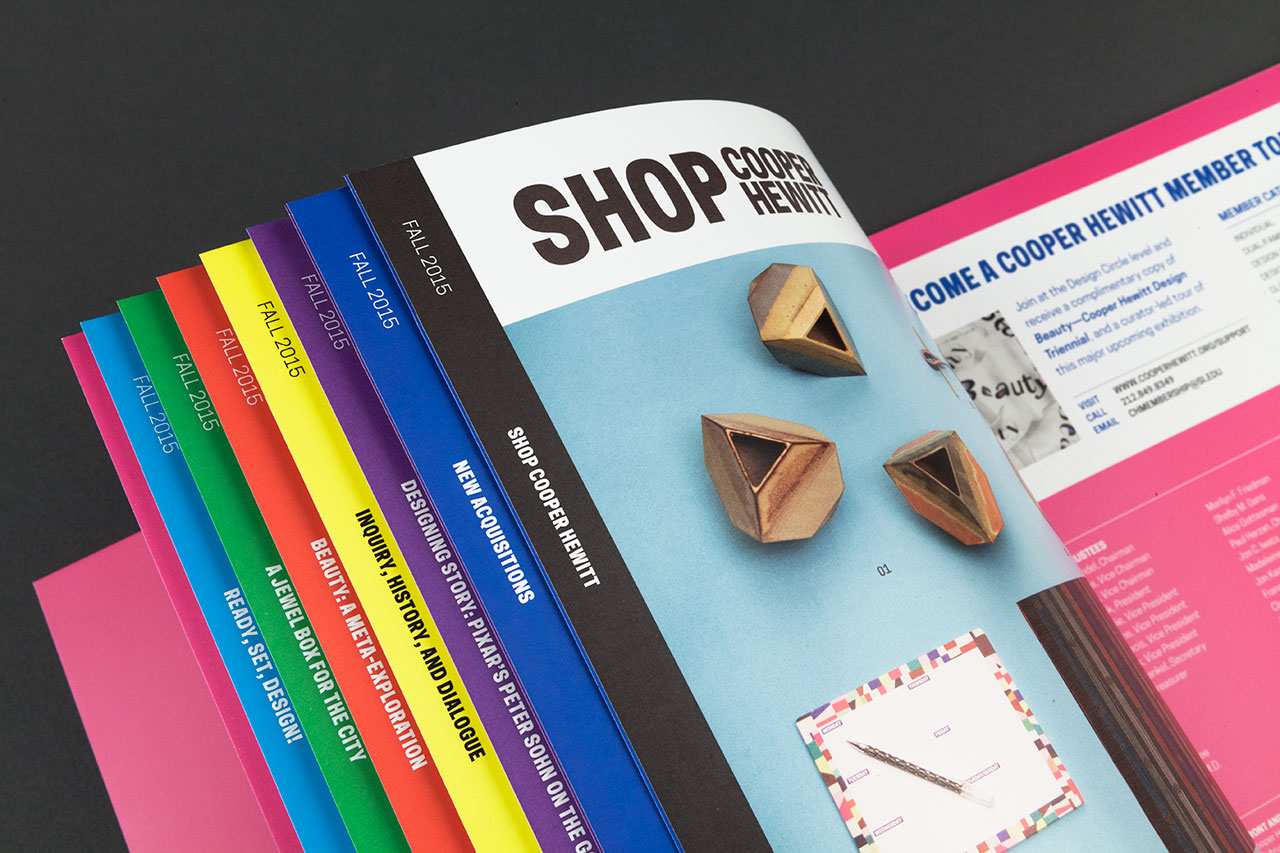
The identity becomes a retail brand at Shop Cooper Hewitt, the museum store. The Shop sub-brand appears in a pattern on wrapping paper and in the interiors of bags, which ask shoppers to “please reuse” in a note in the Cooper Hewitt typeface at the bottom of the bag. (The message is a wink at the idea behind the identity as much as it’s a reminder to recycle.) The Cooper Hewitt wordmark doubles as a publishing imprint on museum publications such as Making Design: Cooper Hewitt, Smithsonian Design Museum Collection, a massive 912-page book designed by Irma Boom that is the museum’s first new collection book since 1997.
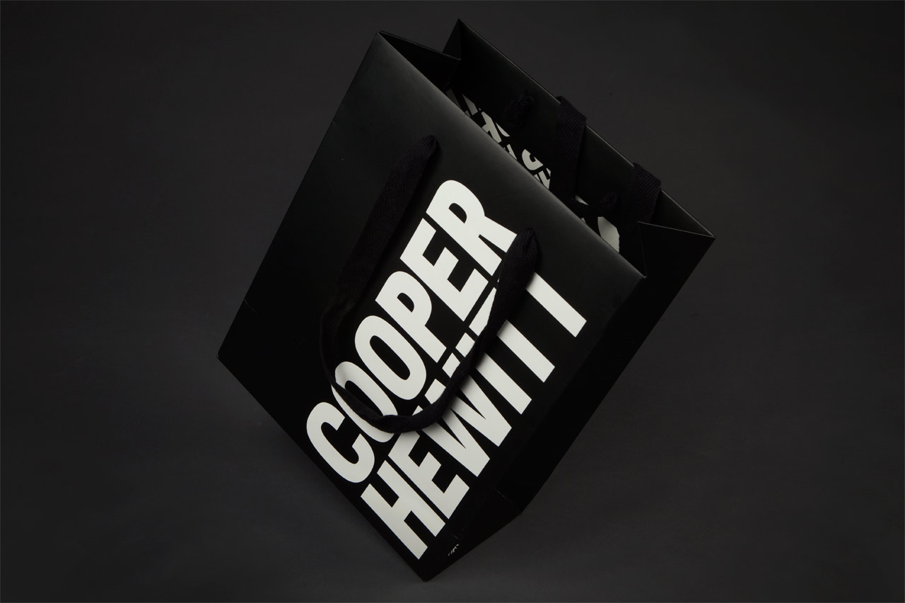
Shop Cooper Hewitt shopping bag.
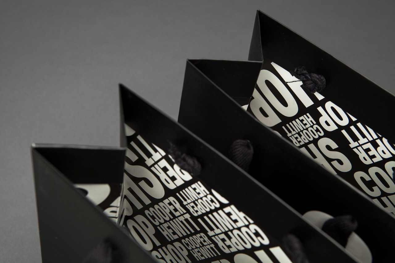
The Shop Cooper Hewitt logo is used as a pattern on the interiors of bags, with the words “Please Reuse” at the bottom.
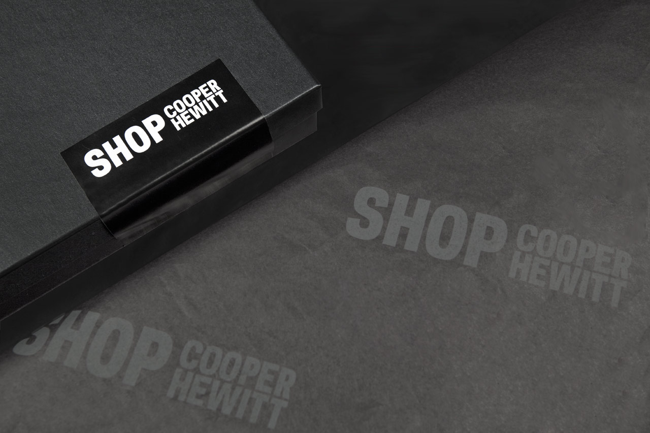
The Shop Cooper Hewitt sub-brand, seen here on stickers and wrapping paper, places the name on one line in balance with the wordmark.
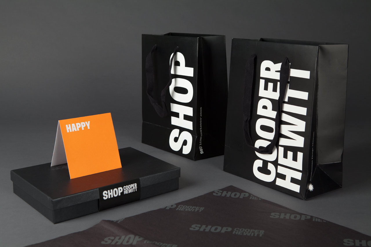
Packaging for the museum store. “SHOP” appears on one side of the bags, and “COOPER HEWITT” on the other.

Gift cards.
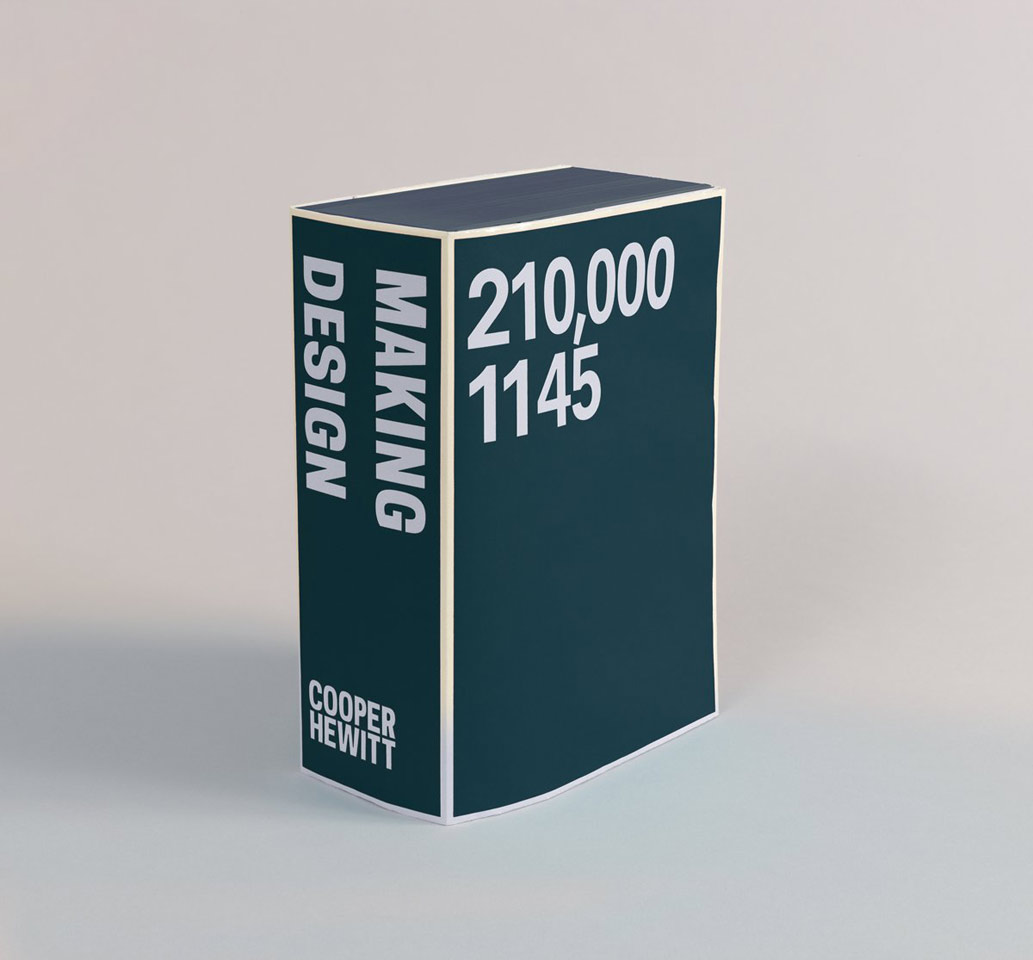
The logo used as a publishing imprint on Making Design, the book designed by Irma Boom.
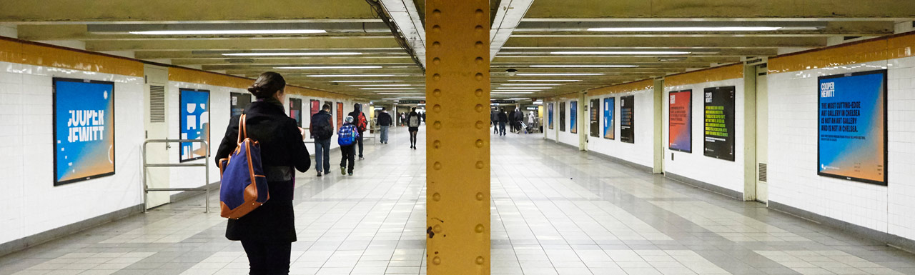
The Cooper Hewitt typeface had the starring role in the ad campaign that accompanied the museum’s relaunch. Designed by Wieden+Kennedy, the campaign revealed the endlessly expressive possibilities of the identity as the logo and its letterforms were taken apart and rearranged again in quirky, provocative treatments that demanded to be read. Sniped in posters all over New York City, the series looked nothing like the typically staid, stoic visual language of museums and showed how the identity can be playfully stretched and adapted by other designers to bring their own creativity to the mix.
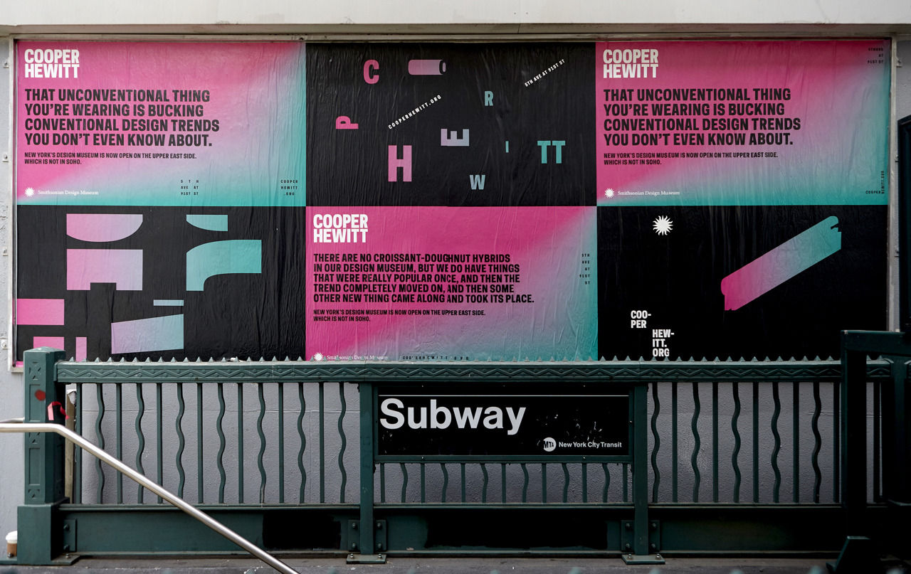
Advertising campaign by Weiden and Kennedy.
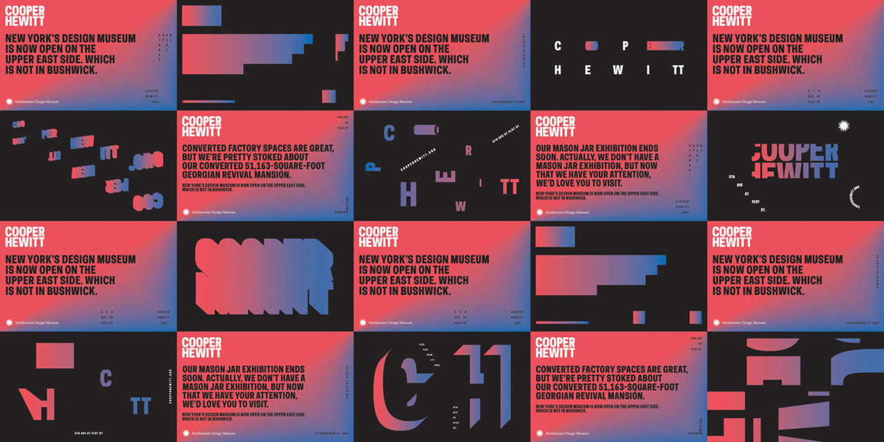
Advertising campaign by Weiden and Kennedy.
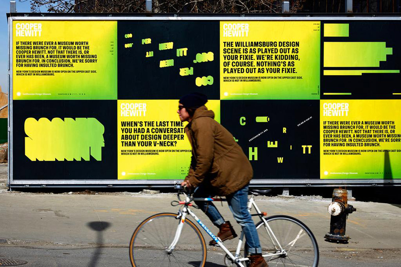
Advertising campaign by Weiden and Kennedy.
Advertising campaign by Weiden and Kennedy.
In what is perhaps the truest test of a well-designed identity, the system holds up in the volume of everyday institutional communications and collateral produced by the museum and its in-house design department, from promotional graphics for special exhibitions to the mailers and invites for events like the National Design Awards. The branding can currently be seen in materials for the Beauty—Cooper Hewitt Design Triennial, on view through August 21, and Thom Browne Selects, on view through October 23. Each piece simultaneously reads as “Cooper Hewitt” and still maintains its own individuality. Together, the materials project a unified and richly varied visual personality for Cooper Hewitt, and highlight how the identity and typeface can be used by designers—and everyone—to help bring design to life.
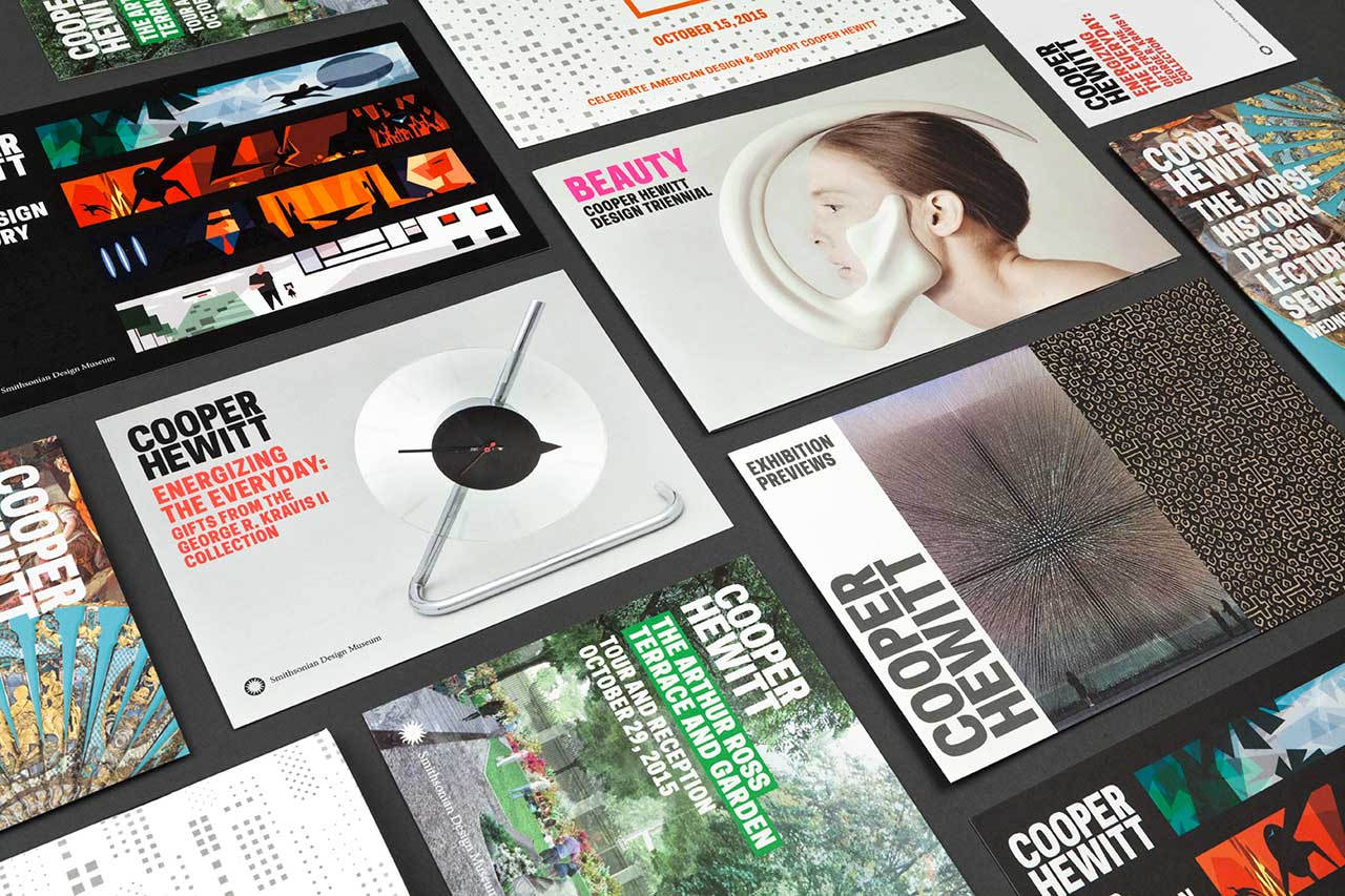
Exhibition collateral.
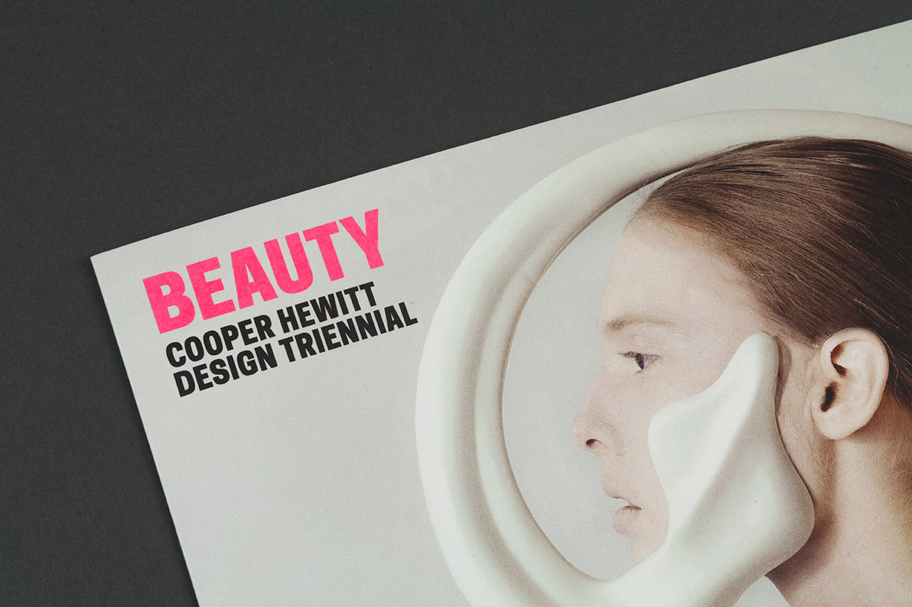
Beauty–Cooper Hewitt Design Triennial exhibition announcement.
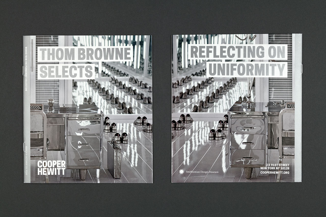
Thom Browne Selects exhibition brochure.
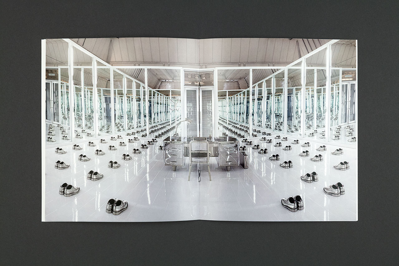
Spread from the Thom Browne Selects brochure.
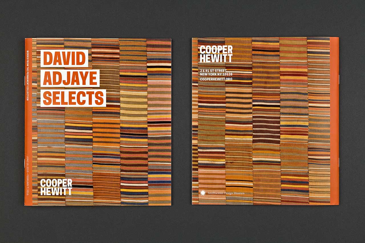
Brochure for the David Adjaye Selects exhibition.
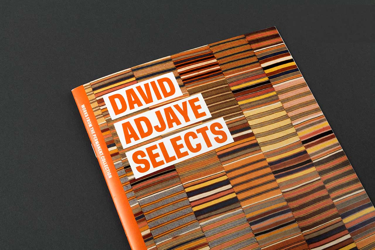
Brochure for the David Adjaye Selects exhibition.
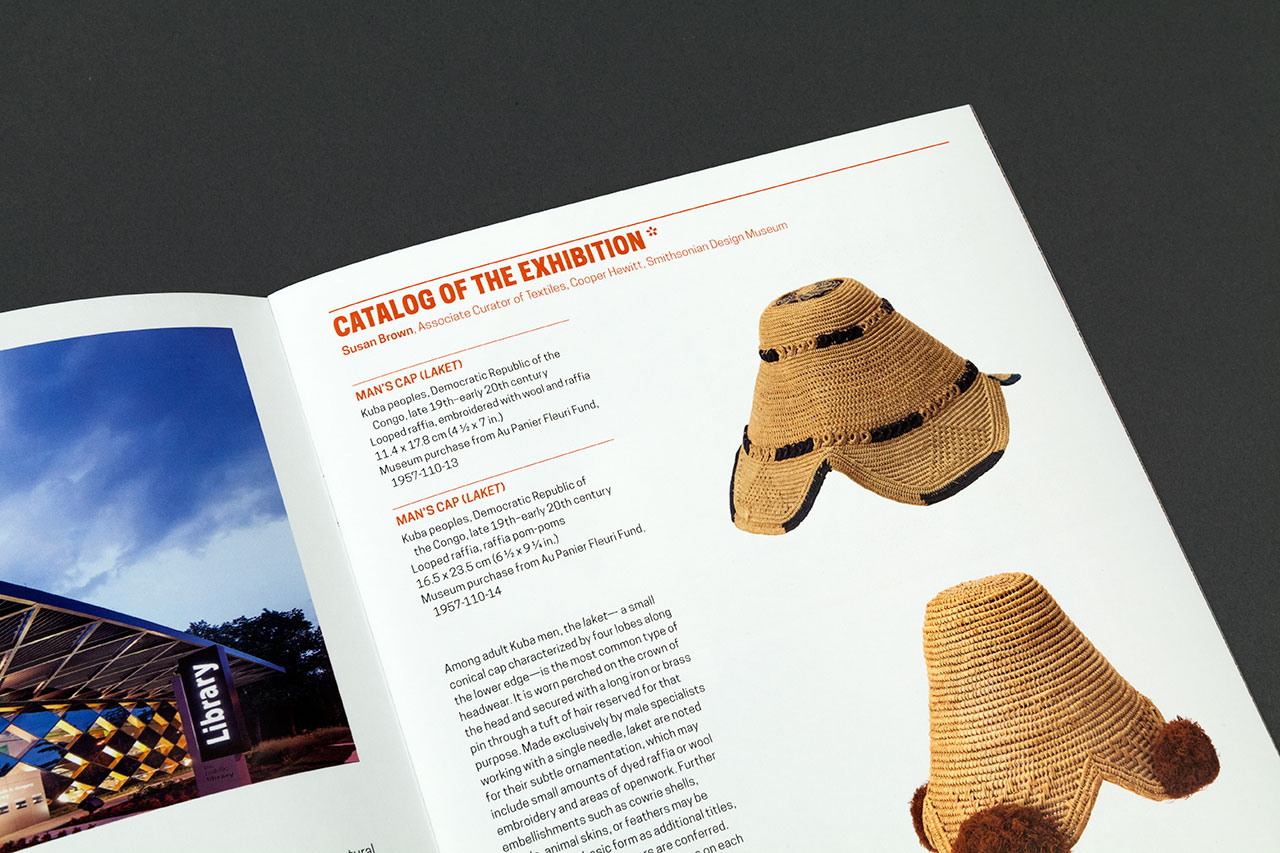
David Adjaye Selects exhibition brochure.
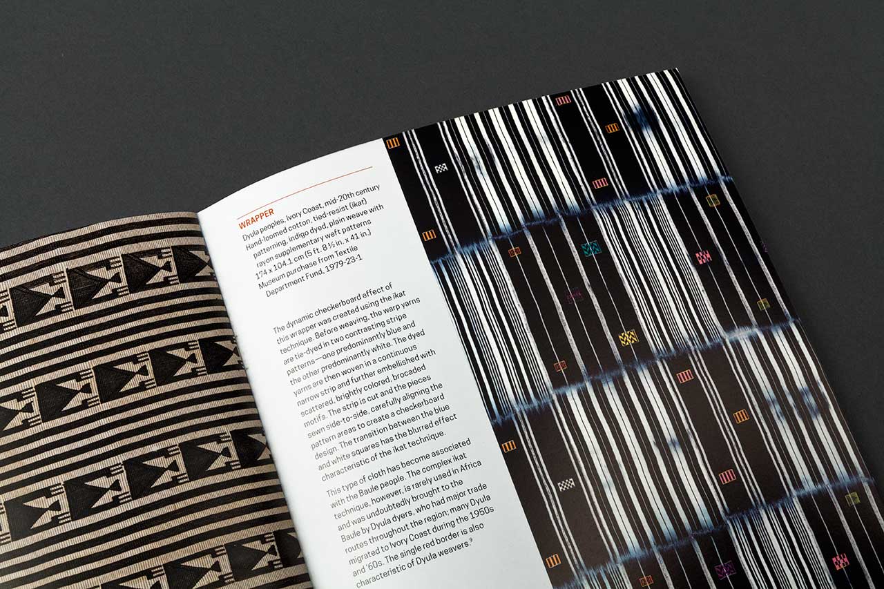
David Adjaye Selects exhibition brochure.
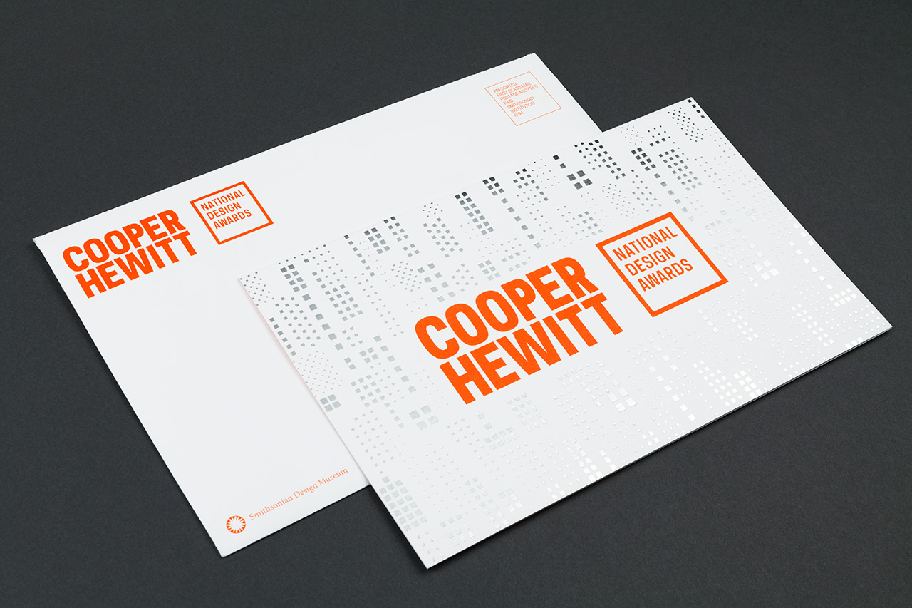
National Design Awards invites.
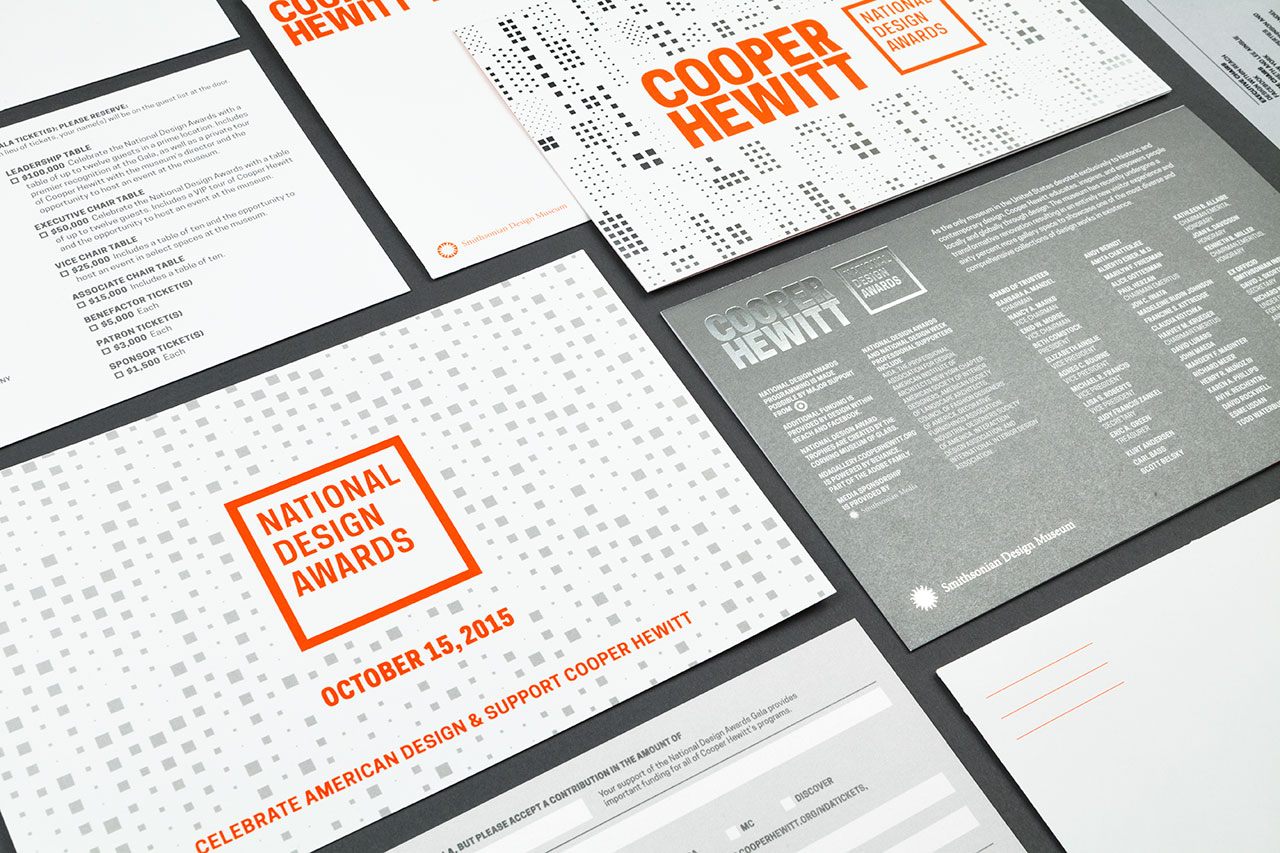
National Design Awards invites.
Project Team
Pentagram
Identity: Eddie Opara, partner-in-charge and designer; Ken Deegan, designer. Cooper Hewitt typeface designed by Chester Jenkins at Village.
Environmental Graphics and Signage: Michael Gericke, partner-in-charge and designer; Don Bilodeau, associate and designer; Elizabeth Kim, Jed Skillins, Qian Sun, Jessie Wu and Beth Gotham, designers; Amy Boyd and Kelsey Carter, project coordinators.
Website: Eddie Opara, partner-in-charge and designer; Ken Deegan and Frank LaRocca, designers. Development by Matcha Labs.
Exhibition Graphics: Eddie Opara, partner-in-charge and designer; Brankica Harvey, associate and designer; Yo-E Ryou and Pedro Mendes, designers; Carrie Brody, project coordinator.
Cooper Hewitt, Smithsonian Design Museum
Ann Sunwoo, Graphic Designer, Communications and Marketing